
Interpreting Scatter Graphs
- Scatter graphs allow businesses to compare two variables such as sales volume and advertising to establish if there is any correlation between them
Diagram of a Typical Scatter Graph
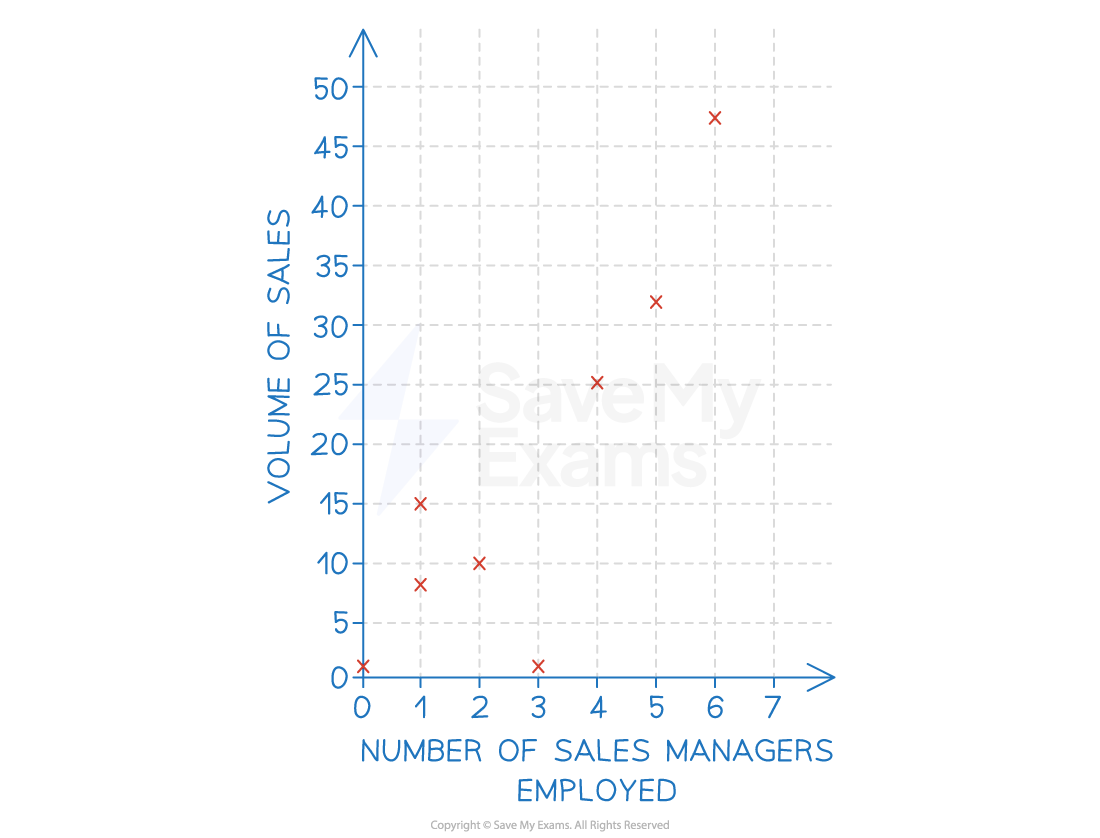
An example of a scatter graph showing the number of sales managers employed by a business and the volume of Items sold
Types of correlation
- A correlation exists where there is a relationship or connection between two variables
- A positive correlation means as one variable increases, so does the other variable
- A line of best fit that slopes upwards can be identified
- A negative correlation means as one variable increases, the other variable decreases
- A line of best fit that slopes downwards can be identified
- No correlation means there is no connection between the two variables
- It is not possible to identify a line of best fit
- It is not possible to identify a line of best fit
Diagram of Positive, Negative and No Correlation
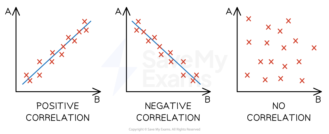
The main types of correlation between two variables
- Correlation does not always indicate a relationship or causation between two sets of variables so businesses need to conduct research to establish whether a relationship exists as well as the strength of that relationship
Line of best fit
- A line of best fit (regression line) is a visualisation of a correlation between two sets of data
- It is drawn roughly through the middle of all of the points on a scatter diagram
- The line may not go directly through any data points - but should have the same amount of data points above it as below it
- A strong (positive or negative) correlation exists when data points sit close to the line of best fit
- The further the distance between the line of best fit and the spread of data points, the weaker the (positive or negative) correlation
- Where a line of best fit can be identified and when causation is determined, a business can extrapolate the data to make predictions around changes to either of the variables
- E.g. extrapolation the line of best fit in the example below, the business could predict that employing seven sales managers would be result in likely sales of 46 units
- E.g. extrapolation the line of best fit in the example below, the business could predict that employing seven sales managers would be result in likely sales of 46 units
- Extrapolation assumes that what has happened in the past will be the same as what will happen in the future
Diagram of a line of best fit
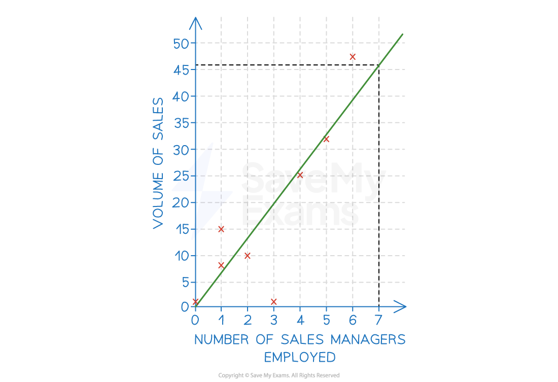
An example of a scatter graph with a line of best fit showing the number of sales managers employed by a business and the volume of items sold
- Extrapolation works best when there is a strong correlation between the two data sets
Exam Tip
When drawing a line of best fit you should try to include as many data points above the line as below the line.
Watch out for outlying data - if there is more than one outlier above the line, adjust your line of best fit upwards. Similarly, if there is more than one outlier below the line, adjust your line of best fit downwards. Just one outlier should not influence your line of best fit.
