1 20 marks
‘Addressing socio-economic issues is more important than dealing with environmental challenges in the management of urban areas.’
How far do you agree with this view?
How far do you agree with this view?
[20]
Did this page help you?
Did this page help you?
Figure 5a shows the change in population in inner and outer London between 1800 and 2018.
Figure 5b shows the year of peak population in London boroughs.
Figure 5a
The change in population in inner and outer London between 1800 and 2018

Figure 1: Inner and Outer London's total population (1801-2011) (Greater London Authority, 2012).
Figure 5b
Year of peak population in London boroughs
|
London Population infographics x 2 cannot be reproduced here due to third-party copyright restrictions. |
Note: The boroughs show the census year at which the population reached its peak.
[6]
Did this page help you?
Did this page help you?
Figure 5 shows the change in life expectancy along the number 83 bus route in Sheffield, a city in the UK. The index of multiple deprivation is also shown on the map.
Figure 5
the change in life expectancy along the number 83 bus route in Sheffield,
a city in the UK. The index of multiple deprivation is also shown on the map.
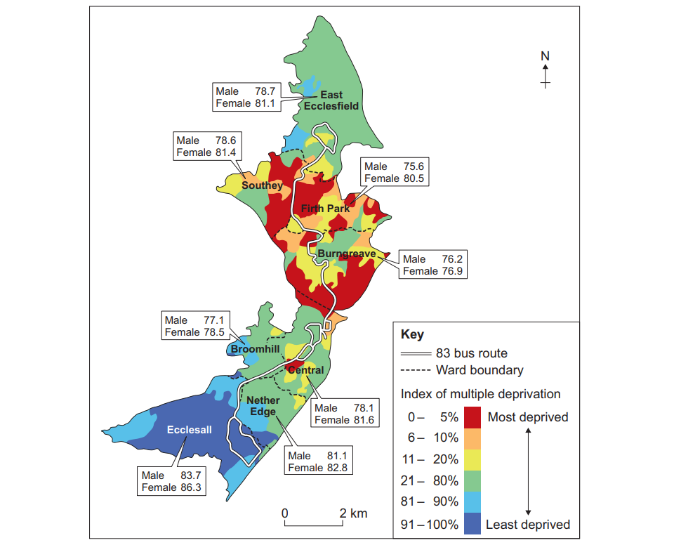
Note: The life expectancy data provided is the average for each ward.
Did this page help you?
Did this page help you?