Levels of Organisation (AQA GCSE Biology): Revision Note

Exam code: 8461

Lára Marie McIvor

Written by: Lára Marie McIvor

Reviewed by: Dr Natalie Lawrence

Updated on

Producers

  • Photosynthetic organisms are the producers of biomass for life on Earth

  • They produce their own food using energy from the Sun

  • A producer has the following characteristics:

    • They are at the start of every food chain (the first trophic level, which is always the biggest)

    • They can photosynthesise (producers are normally green plants or algae)

    • They make glucose by photosynthesis

    • They use this glucose to produce other biological molecules, which then make up the producer’s biomass (some of the glucose produced is also used in respiration to release energy for the cell)

    • In extreme environments (such as underwater volcanic vents) the producers are not photoautotrophs but chemoautotrophs (who produce organic molecules without using energy from the Sun)

Food chains

  • A simple way to show the feeding interactions between the organisms in a community is with a food chain

  • A food chain shows the transfer of energy from one organism to the next

  • The source of all energy in a food chain is light energy from the Sun

  • The arrows in a food chain show the transfer of energy from one level of the food chain to the next

Levels in a food chain

  1. Producer: food chains always begin with a producer

  2. Primary consumer: producers are eaten by primary consumers (herbivores/omnivores)

  3. Secondary consumer: primary consumers are eaten by secondary consumers (carnivores/omnivores)

  4. Tertiary consumer: secondary consumers are eaten by tertiary consumers (carnivores/omnivores)

An example food chain

Diagram showing energy transfer through the food chain grass → mouse → owl. An arrow from the Sun to the grass shows energy entering the food chain as light. Arrows from the grass to the mouse and from the mouse to the owl show the direction of energy transfer between organisms.
Transfer of energy through a food chain from grass to mouse to owl

Use this image

  • Grass:

    • Producer

    • Makes its own food using energy from sunlight in photosynthesis

  • Mouse:

    • Primary consumer

    • Eats the producer

  • Owl:

    • Secondary consumer

    • Eats the primary consumer

Investigating ecosystems

  • Ecology is the branch of biology that studies the distribution and abundance of species, the interactions between species, and the interactions between species and their abiotic environment

  • Ecologists are biologists that study these interactions by investigating ecosystems

  • Ecologists determine the distribution and abundance of species in an ecosystem using quadrats and transects

  • They use quadrats and transects in order to do this

Quadrats

  • Quadrats are square frames made of wood or wire

  • They can be a variety of sizes e.g. 0.25 m2 or 1 m2

  • They are placed on the ground and the organisms within them are recorded

  • They can be used to measure the abundance of plants or slow-moving animals
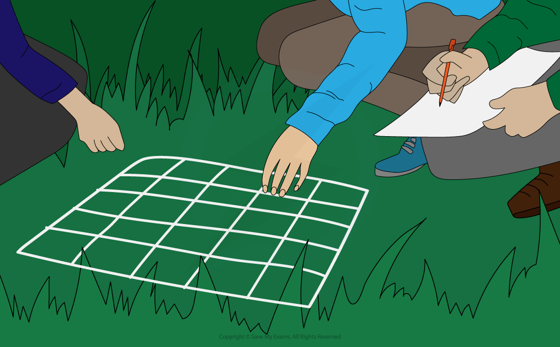
Illustration of students using a square, gridded quadrat placed on grass to sample organisms. One student examines the organisms within the quadrat while another records the results.
Using a quadrat to sample the abundance and distribution of organisms in an area

Use this image

  • Quadrats can be used to measure abundance by recording:

    • The number of an individual species: the total number of individuals of a single species (e.g.. buttercups) is recorded

    • Species richness: the total number of different species (but not the number of individuals of each species) is recorded

    • Percentage cover: the approximate percentage of the quadrat area in which an individual species is found is recorded (this method is used when it is difficult to count individuals of the plant species being recorded e.g. grass or moss)

Diagram of how to estimate percentage cover using a quadrat

Diagram showing a quadrat divided into 100 squares, with squares containing grass shown in light green and moss in darker green. Grass covers 45 squares, giving a percentage cover of 45%, calculated as 45 ÷ 100 × 100. Moss covers 42 squares, giving a percentage cover of 42%. The method involves counting the squares covered by each organism, dividing by the total number of squares in the quadrat and multiplying by 100.
Calculating the percentage cover of grass and moss using a quadrat

Use this image

Transects

  • A transect is used to measure how the abundance of a species changes along the habitat, e.g. changing altitude on a hillside, or from open field to dense woodland, or along the shoreline at the coast

    • A line called a transect is set up through the changing habitat to be investigated with a tape measure

    • A quadrat is then placed at regular intervals (e.g. every 5 metres) along the transect

    • At each interval, the quadrat can be used to record the number of an individual species, species richness or percentage cover

  • Transects are useful for investigating how the abundance of a species is affected by an abiotic factor (e.g. light intensity, moisture levels, soil depth, altitude etc)

Diagram of how to use a transect

Diagram of a hillside showing a transect running from an altitude of about 70 m to 0 m. Eight quadrats are placed at regular intervals along the transect. Orange dots represent buttercups, which become more abundant towards the lower altitudes of the hillside.
Using a belt transect and quadrats to investigate the distribution of buttercups along a hillside

Use this image

Examiner Tips and Tricks

When estimating percentage cover, you can count a square (and include it in your calculations) if more than half of it is covered by the species.

Abundance of organisms

Worked Example

A student is investigating whether buttercups are more abundant in an open field or in woodland. In each habitat, the student randomly places 10 quadrats and records the number of buttercups in each quadrat.

Their results table is shown below.

Quadrat number

Open field

Woodland

1

5

3

2

5

2

3

7

4

4

1

5

5

2

1

6

5

2

7

3

5

8

4

2

9

7

3

10

6

0

Calculate the mean, median and mode buttercup abundance in each habitat.

Answer:

Calculating the mean

Find the total number of buttercups in each habitat (add the quadrat findings together).

  • open field: 5 + 5 + 7 + 1 + 2 + 5 + 3 + 4 + 7 + 6 = 45

  • woodland: 3 + 2 + 4 + 5 + 1 + 2 + 5 + 2 + 3 + 0 = 27

Divide each total by the number of quadrats (in this example there are 10 quadrats). This value is the arithmetic mean.

  • open field: 45 ÷ 10 = 4.5

  • woodland: 27 ÷ 10 = 2.7

The mean number of buttercups per quadrat in the open field is 4.5.

The mean number of buttercups per quadrat in the woodland is 2.7.

Calculating the median

For each habitat, place the set of numbers in increasing order of size.

  • number of buttercups in open field: 1, 2, 3, 4, 5, 5, 5, 6, 7, 7

  • number of buttercups in woodland: 0, 1, 2, 2, 2, 3, 3, 4, 5, 5

The median is the number that is in the middle. If you have an even number of values, calculate the average of the two middle numbers by adding them together and dividing by two.

  • open field: (5 + 5) ÷ 2 = 5

  • woodland: (2 + 3) ÷ 2 = 2.5

Calculate the mode

The mode is the value that occurs most often.

  • The mode number of buttercups per quadrat in the open field is 5, as this value was recorded 3 times

  • The mode number of buttercups per quadrat in the woodland is 2, as this value was recorded 3 times.

Worked Example

A student is investigating how the abundance of buttercups changes with increasing altitude. They set up a transect on the side of a hill and placed a quadrat at every 10 metres of altitude gained. They then recorded the number of buttercups found in each quadrat.

Their results table is shown below.

Altitude (m)

Number of Buttercups Recorded in Quadrat

0

84

10

66

20

62

30

45

40

30

50

30

60

13

70

0

Draw a graph to show how the abundance of buttercups changes with increasing altitude. Draw a line of best fit.

Answer:

Scatter graph showing the number of buttercups recorded in a quadrat against altitude. Altitude is the independent variable on the x-axis, ranging from 0 to 70 m, and number of buttercups is the dependent variable on the y-axis. The plotted points show an overall decrease in buttercup abundance as altitude increases, from about 84 buttercups at 0 m to 0 at 70 m. A downward-sloping line of best fit is drawn through the data. Labels highlight good graph-drawing practice: use sensible scales, label axes with units, plot points accurately, use at least half the available space and draw a line of best fit when required.
Graph showing how buttercup abundance changes with altitude, with a line of best fit

Use this image

Examiner Tips and Tricks

When studying the abundance of organisms, you should be able to:

  • Understand the terms mean, mode and median

  • Calculate arithmetic means

  • Plot and draw appropriate graphs selecting appropriate scales for the axes

Feeding relationships

  • Producers are eaten by primary consumers, which in turn may be eaten by secondary consumers who are themselves eaten by tertiary consumers

  • Consumers that kill and eat other animals are predators, and those eaten are prey

  • In a stable community the numbers of predators and prey rise and fall in cycles

  • Predator-prey cycles are always out-of-phase with each other as it takes time for one population to respond to a change in the other population.

    • For example, the peak in the Canadian lynx population occurs after the peak in the snowshoe hare population, as it takes time for the lynx to reproduce and for their numbers to increase.

A model a predator-prey cycle between the Canadian lynx and the snowshoe hare

Graph showing changes in snowshoe hare and Canadian lynx population sizes over time. Both populations rise and fall in repeating cycles. Peaks in the snowshoe hare population are followed by peaks in the Canadian lynx population, showing that changes in predator numbers lag behind changes in prey numbers.
Predator–prey population cycles of snowshoe hares and Canadian lynx

Use this image

  • The graph above demonstrates some of the key patterns of predator-prey cycles:

  1. The number of predators increases as there is more prey available

  2. The number of prey then decreases as there are now more predators

  3. The number of predators decreases as there is now less prey available

  4. The number of prey increases as there are now fewer predators

  5. The cycle now repeats

Examiner Tips and Tricks

You should be able to interpret graphs used to model predator-prey cycles

Unlock more, it's free!

Join the 100,000+ Students that ❤️ Save My Exams

the (exam) results speak for themselves:

Build on this topic

Lára Marie McIvor

Author: Lára Marie McIvor

Expertise: Content Creator

Lára graduated from Oxford University in Biological Sciences and has now been a science tutor working in the UK for several years. Lára has a particular interest in the area of infectious disease and epidemiology, and enjoys creating original educational materials that develop confidence and facilitate learning.

Dr Natalie Lawrence

Reviewer: Dr Natalie Lawrence

Expertise: Content Writer

Natalie has a MCantab, Masters and PhD from the University of Cambridge and has tutored biosciences for 14 years. She has written two internationally-published nonfiction books, produced articles for academic journals and magazines, and spoken for TEDX and radio.