Data Presentation (Cambridge (CIE) O Level Geography) : Revision Note
Data Presentation
Data presentation
There are different types of data
Quantitative and qualitative
Continuous and discrete
There are many ways in which data can be presented
Graphs
Annotated photographs
Field sketches
Maps
Diagrams
The types of data presentation used will depend on the data collected
Graphical skills
Much of the data collected will be presented in the form of graphs of some form
Each type of graph is suitable for particular data sets
The graphs also may have advantages and disadvantages
Bar graphs
One of the simplest methods to display discrete data
Bar graphs are useful for:
Comparing classes or groups of data
Changes over time
Strengths | Limitations |
|---|---|
Summarises a large set of data | Requires additional information |
Easy to interpret and construct | Does not show causes, effects or patterns |
Shows trends clearly | Can only be used with discrete data |

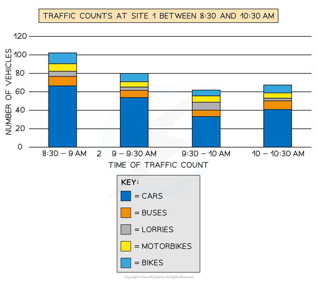
Compound or divided bar chart
The bars are subdivided to show the information with all bars totalling 100%
The main use of a divided bar chart is to compare numeric values between levels of a variable such as time
Population pyramid
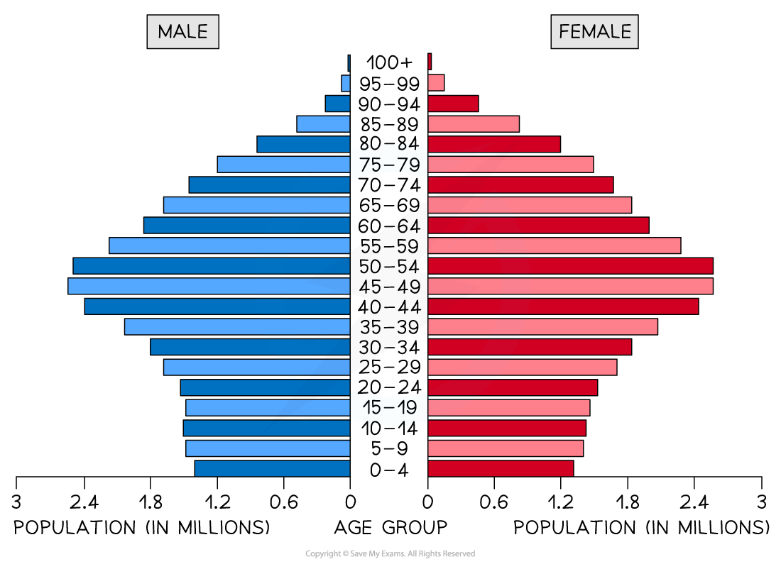
A type of histogram
Used to show the age-sex of a population
Can be used to show the structure of an area/country
Patterns are easy to identify
Line graphs
One of the simplest ways to display continuous data
Both axes are numerical and continuous
Used to show changes over time or space
Strengths | Limitations |
|---|---|
Shows trends and patterns clearly | Does not show causes or effects |
Quicker and easier to construct than a bar graph | Can be misleading if the scales on the axis are altered |
Easy to interpret | If there are multiple lines on a graph it can be confusing |
Requires little written explanation |
|
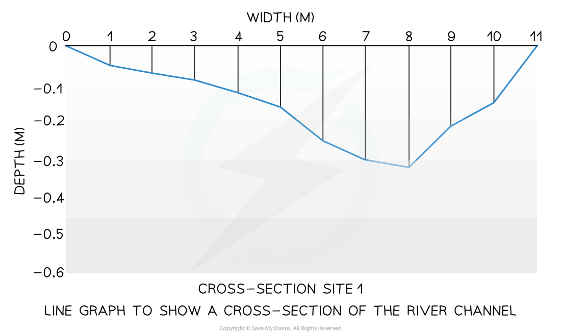
A river cross-section is a particular form of line graph because it is not continuous data but the plots can be joined to show the shape of the river channel
Pie chart
Used to show proportions, the area of the circle segment represents the proportion
A pie chart can also be drawn as a proportional circle
Pie charts can be located on maps to show variations at different sample sites
Strengths | Limitations |
|---|---|
Clearly shows the proportion of the whole | Do not show changes over time |
Easy to compare different components | Difficult to understand without clear labelling |
Easy to label | Hard to compare two sets of data |
Information can be highlighted by separating segments | Can only use for a small number of categories otherwise lots of segments become confusing |

Pie Chart Showing Energy Sources in an Area
Rose diagrams
Use multidirectional axes to plot data with bars
Compass points are used for the axis direction
Can be used for data such as wind direction, noise or light levels
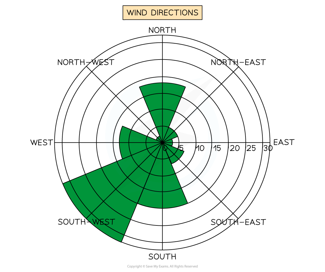
Wind Direction Shown on a Rose Diagram
Triangular graphs
Have axes on three sides all of which go from 0-100
Used to display data which can be divided into three
The data must be in percentages
Can be used to plot data such as soil content, employment in economic activities

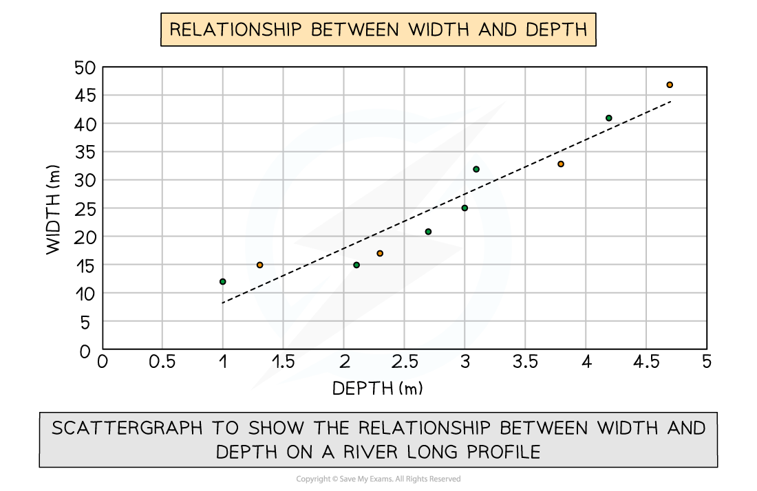
Scatter graph
Points should not be connected
The best fit line can be added to show the relations
Used to show the relationship between two variables
In a river study, they are used to show the relationship between different river characteristics such as the relationship between the width and depth of the river channel
Strengths | Limitations |
|---|---|
Clearly shows data correlation | Data points cannot be labeled |
Shows the spread of data | Too many data points can make it difficult to read |
Makes it easy to identify anomalies and outliers | Can only show the relationship between two sets of data |
Examiner Tips and Tricks
In the exam, you will not be asked to draw an entire graph. However, it is common to be asked to complete an unfinished graph using the data provided. You may also be asked to identify anomalous results or to draw the best fit line on a scattergraph.
Take your time to ensure that you have marked the data on the graph accurately
Use the same style as the data which has already been put on the graph
Bars on a bar graph should be the same width
If the dots on a graph are connected by a line you should do the same
Choropleth map
Maps which are shaded according to a pre-arranged key
Each shade represents a range of values
It is common for one colour in different shades to be used
Can be used for a range of data such as annual precipitation, population density, income levels, etc...
Strengths | Limitations |
|---|---|
The clear visual impression of the changes over space | Makes it seem as if there is an abrupt change in the boundary |
Shows a large amount of data | Distinguishing between shades can be difficult |
Groupings are flexible | Variations within the value set are not visible |

Proportional symbols map
The symbols on the map are drawn in proportion to the variable represented
Usually, a circle or square is used but it could be an image
Can be used to show a range of data, for example, population, wind farms and electricity they generate, traffic or pedestrian flows
Strengths | Limitations |
|---|---|
Illustrates the differences between many places | Not easy to calculate the actual value |
Easy to read | Time-consuming to construct |
Data is specific to particular locations | Positioning on a map may be difficult, particularly with larger symbols |
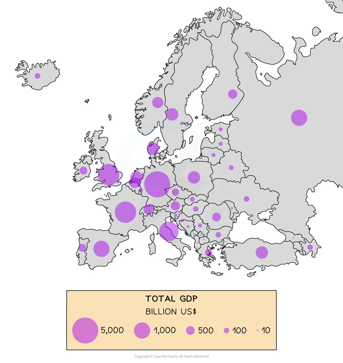
Proportional Circles Map Showing GDP (Billion US$) across Europe
Examiner Tips and Tricks
In the exam, you may be asked why a particular graphical technique is appropriate. You should ensure that you know the advantages and disadvantages of the different data presentation methods.
Photographs
Photographs can be taken to show different aspects of sample sites
These can be annotated as part of the fieldwork analysis
Strengths | Limitations |
|---|---|
An accurate record at the time | Not all photographs are relevant |
Can represent things more clearly than numerical data | Can be subjective and biased as student selects what is photographed |
Can be used to show data collection techniques | Photographs sometimes contain too much information |
Can be used next to historical photographs to show changes over time | They are two dimensional so judging depth is difficult |
Helps recall key features |
|
Field sketches
Should include location/site number, title and compass direction
Includes the key features at a site
Strengths | Limitations |
|---|---|
Things can be left out of the sketch if they are not relevant to the enquiry | The scale in the sketch may be inaccurate |
Smaller important areas can be more detailed | Important details may be missed |
Gives a broad overview of the features | The sketch may contain inaccuracies which affect the analysis for example more litter than there actually was at the site |
Helps recall of key features |
|
Maps
An essential part of any fieldwork enquiry is to show the location of features and sample sites
Maps can also be used to show relevant features such as amenities around the sample sites
Strengths | Limitations |
|---|---|
Size and scale of features/site can be accurately measured | The map may be out of date |
Key to show features around the sample sites | Maps cannot show changes over time |
Allows distribution of features to be shown accurately | Bias may be introduced by highlighting certain features |

You've read 0 of your 5 free revision notes this week
Unlock more, it's free!
Did this page help you?

