Syllabus Edition

First teaching 2023

First exams 2025

|

Working with Statistical Diagrams (CIE IGCSE Maths: Core)

Revision Note

Test yourself

Reading & Interpreting Statistical Diagrams

How do I interpret statistical diagrams?

  • Read and understand the initial sentences describing the situation (context)
    • Underline important words if necessary
  • Look for any keys that may help you to understand the diagram  
    • For example
      • 1 unit represents 20 people
      • Year 10 is the solid line, Year 11 is the dotted line
      • Class A is shaded, class B is striped
  • Read the titles of diagrams and all axes labels 
    • A graph for 'new students at a school' is different to 'all students at the school'
    • A frequency axis that starts at 50 is different to one starting at 0
  • Understand which units are being used
    • Individual lengths may be in centimetres but total length may be in metres
    • Populations may be measured in thousands
  • Look out for any extreme values (outliers / anomalies)
    • One month's temperature might be unusually high
      • Was it a heat wave or a recording error?

How do I draw conclusions from diagrams?

  • Look for overall trends in the diagram
    • Prices increase year on year
    • The temperature peaks in June
  • Use numbers from the graphs
  • Refer to any changes
    • The steepness (gradient) of graph may change
  • Write in full sentences that copy the exact wording from the question
    • 'The number of goats in farm A has decreased by 12 over the 8 month period'
    • Not 'There are fewer of them now'
  • You may need to calculate the mode, median, mean or range to support any explanations
  • Understand why drawing conclusions may not be suitable
    • The data set may be too small to be representative
    • The data set may be biased
    • Consider the scope of the data
      • e.g. Data for January to March cannot be used to predict August

Worked example

The diagram below shows the temperature of a garden in the UK, recorded at 7am on each day of a particular week in March.
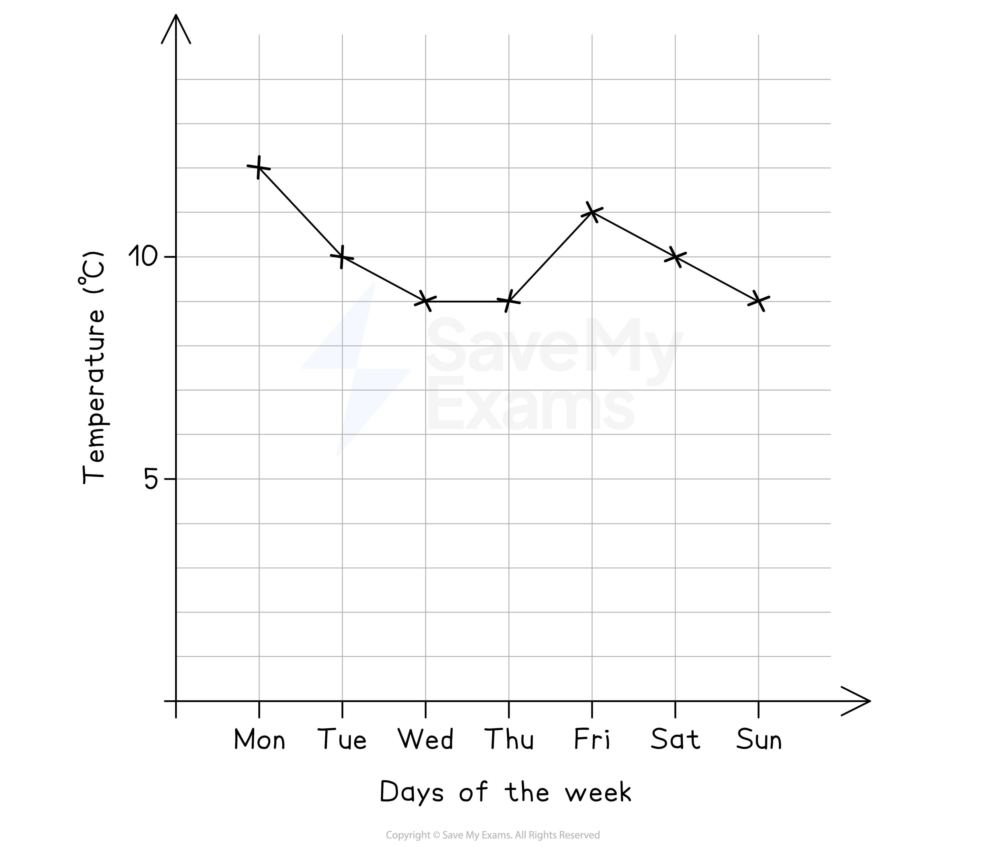
A graph showing the temperature varying throughout the week

(a)

Describe the change in temperature over the first four days.

The trend shows a decrease in the first three days, then a constant temperature
Find numbers from the graph to use in your answer 
Refer to the steepness of the change

The temperature decreases from 12°C on Sunday to 9°C on Wednesday
The decrease is steeper over the first two days
There is then a constant temperature of 9°C on both Wednesday and Thursday


(b)

A gardener claims that, based on the graph, Monday must have experienced the highest temperature that week.

Give a reason as to why this might not be true.

Reread the information at the start
These temperatures were recorded at 7am in the morning (we don't know how hot the rest of the day was)
 

The temperatures on the graph are at 7am each day
The maximum temperature may have been after 7am, on a day that was not Monday


(c)

A journalist wants to use the data shown to claim that the average temperature that week was below 10°C.
The mean of the temperatures shown is 10°C.

Which type of average would you suggest they use? Explain your answer.

The mean of 10°C does not support the claim that the average temperature is below 10°C
Try calculating the mode instead

12, 10, 9, 9, 11, 10, 9 

The most frequent number is 9

The modal temperature is 9°C
9°C < 10°C so using the mode would help the journalist's claim

You could try the median, but it is also 10°C

Comparing Statistical Diagrams

How do I compare statistical diagrams?

  • You may be given two graphs for two different data sets with the same context
  • Compare trends in the graphs
    • Increases, decreases, maximum points
    • Steepness of the change
  • Comment on differences and similarities
  • Explain clearly which part of the graph you are talking about
  • Use numbers from each data set in your comparisons
  • Comment on any extreme values (outliers)
  • Calculate means, medians or modes to compare averages
  • Calculate ranges to compare the spread of values

Examiner Tip

  • Always relate numbers and calculations back to the context of the question.
    • If you don't, you won't score all the marks!

Worked example

The number of books bought during the opening week of a new bookshop is shown below.
The shopkeeper wants to investigate shopping patterns between male and female customers.

A bar chart comparing two sets of data on books

(a)

Briefly summarise the overall trend in the number of books bought by male customers.
 
Look at the heights of the red lines
Comment on how they increase ('briefly' means you do not have to talk about every point)
Use numbers from the graph and exact phrases from the question

The number of books bought by male customers increases
from 10 on Monday up to 15 on both Thursday and Friday


(b)

The shopkeeper says that the changes in the blue lines suggest that the amount of books bought by females varies more than males.

By comparing a suitable statistical measure, show that this is not necessarily true.
 
Variations refers to the spread of data, so compare their ranges
For male and female, subtract the smallest value from the biggest value

Male range is 15 - 10 = 5

Female range is 16 - 12 = 4

Compare the numbers
Explain how this relates to the spread of the data
State how your findings do not agree with the shopkeeper

The range of male customers is greater than that of female customers, 5 > 4
This suggests male customers have a greater spread (variability) in books bought
This is the opposite of what the shopkeeper said


(c)

Give one reason as to why the shopkeeper should not use the data shown to draw conclusions about shopping patterns.
 
Reread the sentences at the beginning
This data is for the opening week of the bookshop only
State that this is unrepresentative of a normal week
Give a specific real life example

The data shown is for the opening week of the bookshop
It is unlikely to be representative of a normal week
   The numbers may increase as the bookshop becomes more popular

Or decrease if the customers lose interest
(Any reasonable example would work)

You've read 0 of your 10 free revision notes

Unlock more, it's free!

Join the 100,000+ Students that ❤️ Save My Exams

the (exam) results speak for themselves:

Did this page help you?

Mark

Author: Mark

Expertise: Maths

Mark graduated twice from the University of Oxford: once in 2009 with a First in Mathematics, then again in 2013 with a PhD (DPhil) in Mathematics. He has had nine successful years as a secondary school teacher, specialising in A-Level Further Maths and running extension classes for Oxbridge Maths applicants. Alongside his teaching, he has written five internal textbooks, introduced new spiralling school curriculums and trained other Maths teachers through outreach programmes.