Syllabus Edition
First teaching 2025
First exams 2027
Factors influencing population structures (Cambridge (CIE) IGCSE Geography) : Revision Note

Population pyramids
The characteristics of a population—the distribution of age, sex, ethnicity, religion, etc.—are known as the population structure
Information about these characteristics is gathered in a census
The population structure is the result of changes in:
fertility
mortality
migration
The two main components of age and sex can be shown on a population pyramid
What is a population pyramid?
Population pyramids (also known as an age structure graph) are used to display the gender and age structure of a given population
They illustrate the distribution of the population across age groups and between male and female
They enable governments nationally and regionally to assess the needs of the population for services such as healthcare and education
This means the governments can estimate and plan for spending
As countries develop and pass through the stages of demographic transition, the shape of the population pyramid changes
Each bar of the population pyramid represents a 5 year age range
The two sides of the population pyramid represent males (usually on the left) and females (usually on the right)
The population pyramid can be used to identify the following groups:
Young dependants
Old dependents
Economically active (working population)
Dependency ratio

Demographic transition and population structure
As countries move through the stages of demographic transition
The shape of the population pyramids reflect the changes

LEDCs like Niger have a concave pyramid shape
Stages 1 and 2 of the model and this indicates:
high birth rate
low life expectancy
high death rate but starting to decrease
high infant mortality rate
a young dependent population dominates

LEDCs/NICs that are a little further along the demographic transition, such as Nepal, have a convex pyramid shape
Stage 3 of the demographic transition model
This indicates:
decreasing birth rate
increasing life expectancy
decreasing death rate
decreasing infant mortality
larger working-age population
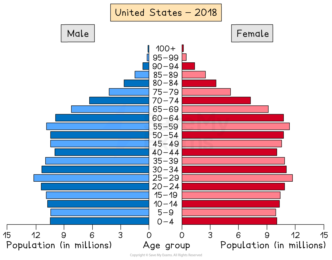
MEDC countries such as the USA have a column-shape
Stage 4 of the demographic transition model
This indicates:
decreasing birth rate
increasing life expectancy
decreasing death rate
low infant mortality
larger working-age population

MEDC countries such as Japan have a pentagon shape with a narrowing base
Stage 5 of the demographic transition model
This indicates:
Decreasing birth rate
Increasing life expectancy
The death rate is higher than the birth rate due to the ageing population
Low infant mortality
Ageing population: older dependent population
Natural increase
Natural increase is calculated by subtracting the death rate from the birth rate
The combination of a decreasing death rate and high birth rate led to rapid natural increase and population explosion
The impacts on population structure often leads to
a larger overall population
a population with a larger proportion of younger people
a higher dependency ratio

A negative rate of natural increase happens when the birth rate is lower than the death rate
When this occurs, it impacts the population structure, leading to:
a shrinking population
an ageing population

Net migration
Net migration is calculated by subtracting the number of emigrants from the number of immigrants
The measurement is given per 1000 people
Positive net migration occurs when there are more immigrants into a country than there are emigrants from the country
Negative net migration occurs when there are more emigrants from a country than there are immigrants into the country
In some countries, migration can lead to an imbalance in the population structure
The UAE has significantly more males than females
Approximately 29% of the population are males between the ages of 25 and 39, whereas only 10.5% of the population are women between 25 and 39
This is the result of the migration of males to the UAE to work in the oil, gas and construction industries

Rapid population growth in some areas as a result of migration can lead to:
increased pressure on services such as healthcare and schools
a shortage of housing
increased traffic congestion
increased water and air pollution
a shortage of food
a lack of clean water

You've read 0 of your 5 free revision notes this week
Sign up now. It’s free!
Did this page help you?