Syllabus Edition
First teaching 2018
Last exams 2026
Data Presentation (Cambridge (CIE) IGCSE Geography): Revision Note
Exam code: 0460 & 0976
Data Presentation
There are different types of data
Quantitative and qualitative
Continuous and discrete
There are many ways in which data can be presented
Graphs
Annotated photographs
Field sketches
Maps
Diagrams
The types of data presentation used will depend on the data collected
Graphical skills
Much of the data collected will be presented in the form of graphs of some form
Each type of graph is suitable for particular data sets
The graphs also may have advantages and disadvantages
Bar graphs
One of the simplest methods to display discrete data
Bar graphs are useful for:
Comparing classes or groups of data
Changes over time
Strengths | Limitations |
|---|---|
|
|

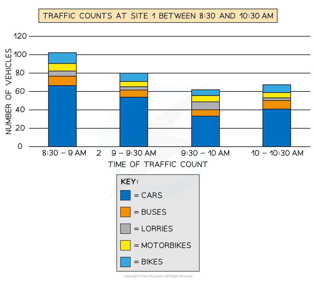
Compound or divided bar chart
The bars are subdivided to show the information with all bars totalling 100%
The main use of a divided bar chart is to compare numeric values between levels of a variable such as time
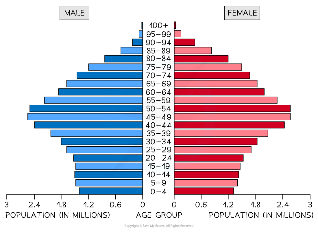
Population pyramid
A type of histogram
Used to show the age-sex of a population
Can be used to show the structure of an area/country
Patterns are easy to identify
Line graphs
One of the simplest ways to display continuous data
Both axes are numerical and continuous
Used to show changes over time or space
Strengths | Limitations |
|---|---|
|
|
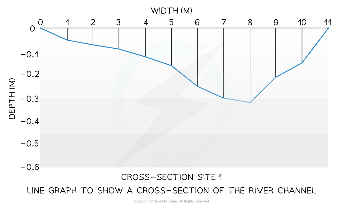
A river cross-section is a particular form of line graph because it is not continuous data but the plots can be joined to show the shape of the river channel
Pie chart
Used to show proportions, the area of the circle segment represents the proportion
A pie chart can also be drawn as a proportional circle
Pie charts can be located on maps to show variations at different sample sites
Strengths | Limitations |
|---|---|
|
|

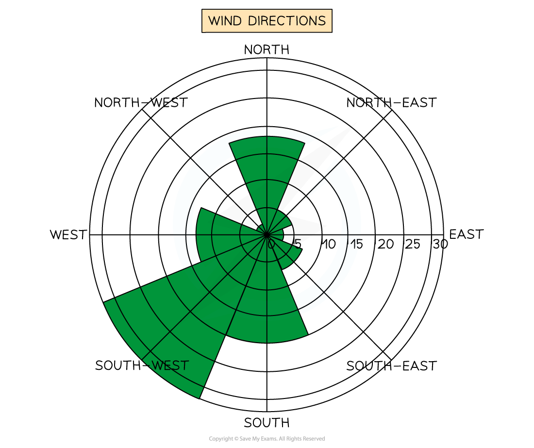
Rose diagrams
Use multidirectional axes to plot data with bars
Compass points are used for the axis direction
Can be used for data such as wind direction, noise or light levels
Triangular graphs
Have axes on three sides all of which go from 0-100
Used to display data which can be divided into three
The data must be in percentages
Can be used to plot data such as soil content, employment in economic activities

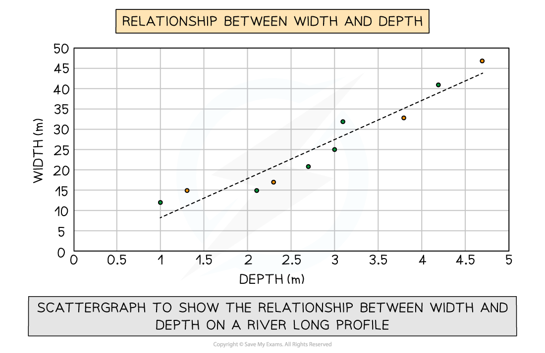
Scatter graph
Points should not be connected
The best-fit line can be added to show the relations
Used to show the relationship between two variables
In a river study, they are used to show the relationship between different river characteristics such as the relationship between the width and depth of the river channel
Strengths | Limitations |
|---|---|
|
|
Examiner Tips and Tricks
In the exam, you will not be asked to draw an entire graph. However, it is common to be asked to complete an unfinished graph using the data provided. You may also be asked to identify anomalous results or to draw the best-fit line on a scattergraph.
Take your time to ensure that you have marked the data on the graph accurately
Use the same style as the data which has already been put on the graph
Bars on a bar graph should be the same width
If the dots on a graph are connected by a line you should do the same
Choropleth map
Maps which are shaded according to a pre-arranged key
Each shade represents a range of values
It is common for one colour in different shades to be used
Can be used for a range of data such as annual precipitation, population density, income levels, etc...
Strengths | Limitations |
|---|---|
|
|

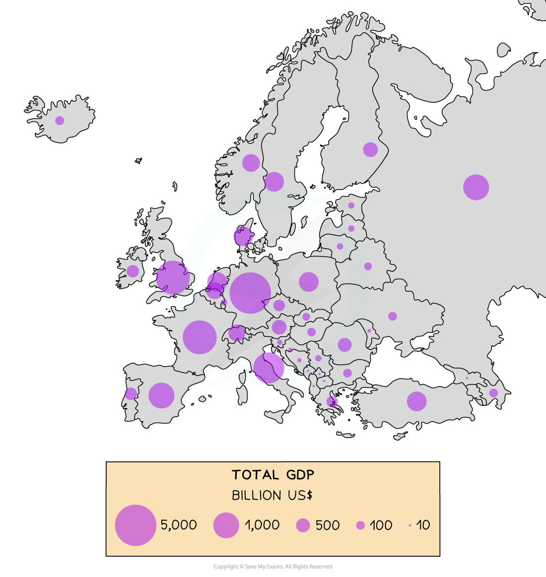
Proportional symbols map
The symbols on the map are drawn in proportion to the variable represented
Usually, a circle or square is used but it could be an image
Can be used to show a range of data, for example, population, wind farms and electricity they generate, traffic or pedestrian flows
Strengths | Limitations |
|---|---|
|
|
Examiner Tips and Tricks
In the exam, you may be asked why a particular graphical technique is appropriate. You should ensure that you know the advantages and disadvantages of the different data presentation methods.
Photographs
Photographs can be taken to show different aspects of sample sites
These can be annotated as part of the fieldwork analysis
Strengths | Limitations |
|---|---|
|
|
Field sketches
Should include location/site number, title and compass direction
Includes the key features at a site
Strengths | Limitations |
|---|---|
|
|
Maps
An essential part of any fieldwork enquiry is to show the location of features and sample sites
Maps can also be used to show relevant features such as amenities around the sample sites
Strengths | Limitations |
|---|---|
|
|

Unlock more, it's free!
Was this revision note helpful?
