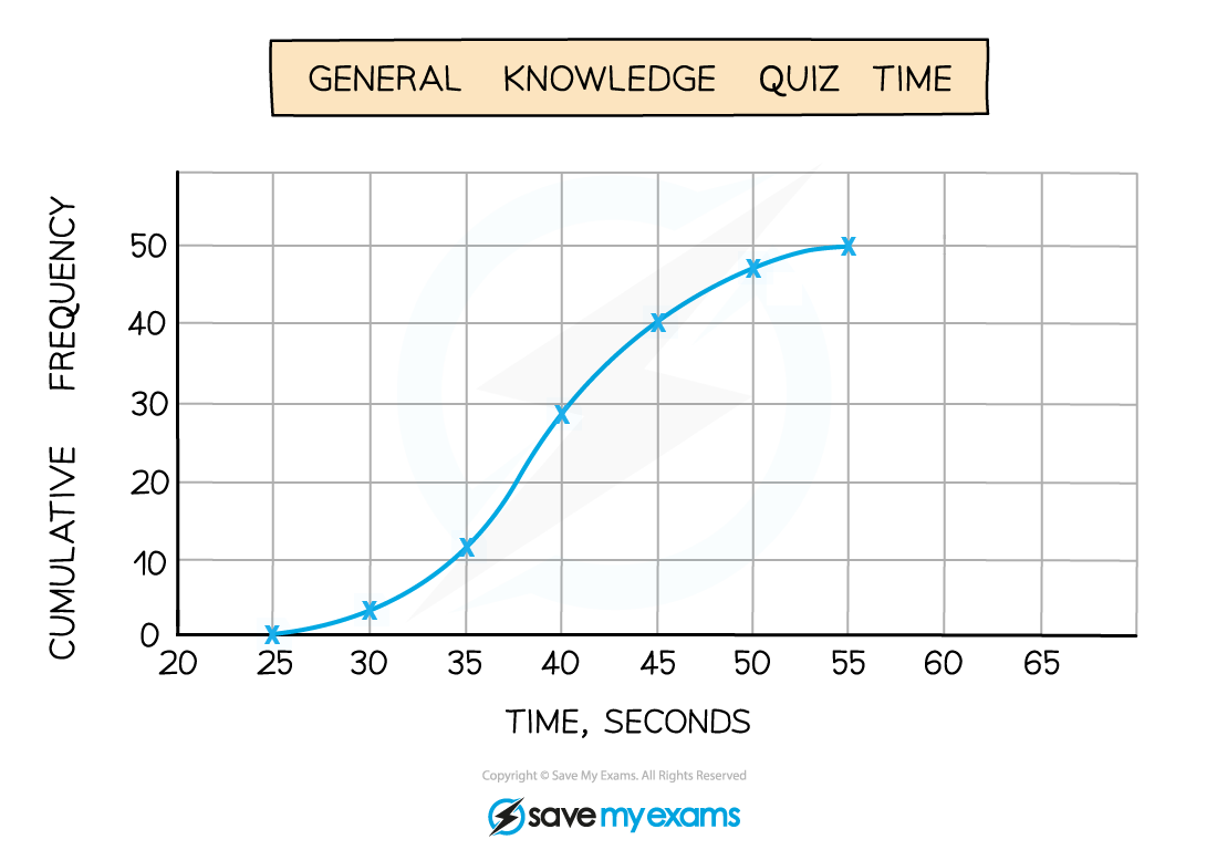
A cumulative frequency diagram, also known as a cumulative frequency graph, is a type of chart used in statistics to show the total number of values that fall below certain levels in a set of data. It is created by plotting cumulative frequencies, which are added up to show a running total, on a graph against the upper boundary of each data class. This helps to easily see patterns, like how many data points are less than a certain value, and is useful for comparing different groups or finding the median, quartiles, and percentiles. It's a helpful tool for students in GCSE Maths to understand data distribution and interpret statistical information.

Examiner-written GCSE Maths revision resources that improve your grades 2x
- Written by expert teachers and examiners
- Aligned to exam specifications
- Everything you need to know, and nothing you don’t

Share this article


 written revision resources that improve your