Scatter Diagrams & Correlation (Edexcel GCSE Statistics: Higher)

Exam Questions

1 hour13 questions
1a
Sme Calculator
2 marks

Andrea collects data on the power (in horsepower) and the fuel economy during city driving (in miles per gallon) for each car in a sample of 38 cars of various types. The scatter diagram was drawn for this information by statistical software.
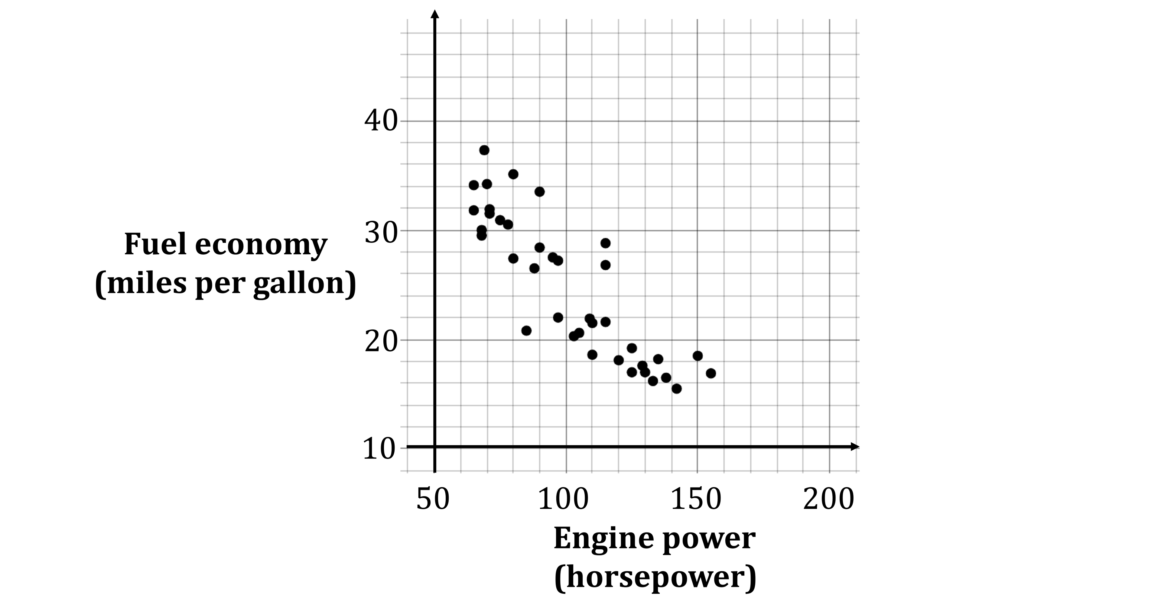
Scatter plot showing fuel economy (miles per gallon) and engine power (horsepower).

Source: www.dasl.datadescription.com

Describe and interpret the type of correlation shown by the scatter diagram.

1b
Sme Calculator
3 marks

The mean of the engine powers in the sample is 101.7 horsepower, to 1 decimal place.

The sum of the fuel economies in the sample is 940.9.

On the scatter diagram,

(i) Find the double mean point of the data,

[2]

(ii) draw a line of best fit through the double mean point.

[1]

1c
Sme Calculator
1 mark

Andrea wants to predict the fuel economy of a car with 190 horsepower.

Explain why it is not appropriate to use the line of best fit on this scatter diagram to find this prediction.

Did this page help you?

2a
Sme Calculator
1 mark

The size (in metres squared) and price (in thousands of pounds) of 12 houses in the same area, are plotted on the scatter diagram below.

Scatter plot showing house prices in thousands of pounds versus size in square metres

One of the points on the scatter diagram represents an outlier.

Draw a circle around the outlier.

2b
Sme Calculator
1 mark

Comment on the price of the house represented by this point.

2c
Sme Calculator
2 marks

Pearson’s product moment correlation coefficient for the 12 houses, including the outlier, is calculated as 0.9019

With the outlier removed, Pearson’s product moment correlation coefficient for the 11 houses is calculated as 0.9736

(i) Give a reason why it might be appropriate to remove the outlier.

[1]

(ii) Give a reason why it might not be appropriate to remove the outlier.

[1]

Did this page help you?

3
Sme Calculator
5 marks

In a local art exhibition, 6 artists displayed their paintings.

The table below shows the scores awarded to each artist by a panel of professional art critics.

The table also shows the rank order of the artists as perceived by a guest judge.

Artist

Score from critics

Guest judge's rank

A

85

4


B

90

1

C

78

3

D

82

2

E

74

6

F

76

5

Use Spearman's rank to investigate how much agreement there is between the critics and the guest judge.

You may use the blank columns in the table for your working.

Did this page help you?

4a
Sme Calculator
2 marks

A zookeeper is studying the relationship between calorie intake open parentheses x close parentheses in kcal and monthly weight gain open parentheses w close parentheses in grams for three different feeding methods for the capybaras at the zoo.

For each feeding method, she collected data on the daily calorie intake open parentheses x close parentheses and the corresponding monthly weight gain open parentheses w close parentheses for a sample of the capybaras. She plotted scatter diagrams for each feeding method and used statistical software to find the equation of the regression line for the data in each scatter diagram.

Here are the equations:

Feeding method

Equation of regression line

A

w equals 0.04 x minus 50

B

w equals 0.045 x minus 25

C

w equals negative 2 x plus 0.045

The zookeeper thinks that she has made a mistake with one of the equations.

Compare the equations of the three regression lines and explain which one is most likely to be incorrect.

Explain your answer in context.

4b
Sme Calculator
3 marks

The zookeeper investigates a fourth feeding method, method D.

She uses statistical software to draw this scatter diagram and the regression line where daily calorie intake is x and monthly weight gain is w.

Find an equation of the regression line of this scatter graph in the form w equals a x plus b.

Graph showing a positive linear correlation between daily calorie intake in kcal (x-axis) and monthly weight gain in grams (y-axis).

Did this page help you?

5
Sme Calculator
3 marks

A car dealership manager is researching how the value of a particular model of car changes as it increases in age.

This is the scatter diagram they obtained using statistical software.

Scatter plot showing correlation between age and value. Axes are labelled "Value" and "Age". In general, as age increases, value decreases.

The statistical software also calculated two correlation coefficients:

  • Spearman’s rank correlation coefficient

  • Pearson’s product moment correlation coefficient

(i) Circle one value in each column below to show the most likely pair of correlation coefficients for this data.

Spearman’s rank correlation coefficient

Pearson’s product moment correlation coefficient

-0.90

-0.90

-0.75

-0.75

0.00

0.00

+0.75

+0.75

+0.90

+0.90

[2]

(ii) Explain your choice of answers in part (i).

[1]

Did this page help you?

1a
Sme Calculator
1 mark

Richard is investigating whether the GDP per capita of a country has an effect on the life expectancy in that country.

Suggest a hypothesis Richard could use for his investigation.

1b
Sme Calculator
1 mark

Richard collected the following information about 10 countries in 2021.

Country

GDP per capita ($)

Life expectancy (years)

Afghanistan

1 486

62.0

Cameroon

2 792

60.3

Egypt

12 868

70.2

Greece

23 732

80.1

Indonesia

12 234

67.6

Kuwait

66 418

78.7

Malta

33 031

83.8

Pakistan

5 464

66.1

Romania

26 103

74.2

United Kingdom

37 134

80.7

Source: www.ourworldindata.org

Richard used statistical software to draw a scatter diagram for the information in the table.

Give a reason why a scatter diagram is an appropriate diagram to use.

1c
Sme Calculator
2 marks

Richard's hypothesis is that countries with a higher GDP per capita, have a higher life expectancy.

He thinks this is because more money is available to spend on healthcare.

In this investigation, which variable is the explanatory variable? Give a reason for your answer.

1d
Sme Calculator
2 marks

The scatter diagram Richard created is shown below.

Scatter plot showing GDP per capita (thousands USD) on the x-axis and life expectancy (years) on the y-axis, with points indicating a positive trend.

Explain, giving a statistical reason, whether or not this scatter diagram supports Richard's hypothesis that countries with a higher GDP per capita, have a higher life expectancy.

1e
Sme Calculator
2 marks

For these 10 countries, the double mean point of the data is (22 126, 72.4).

Using this information, draw a line of best fit on the scatter diagram.

1f
Sme Calculator
1 mark

Using statistical software, Richard finds that the gradient of the line of best fit, when the x-axis is plotted in thousands of dollars, should be 0.326.

Interpret the gradient of the line of best fit.

1g
Sme Calculator
2 marks

Richard later finds that Qatar has a GDP per capita of $143 469 and a life expectancy of 79.3 years.

Determine how this information for Qatar fits with the relationship shown in the scatter diagram for the other countries.

Did this page help you?

2a
Sme Calculator
1 mark

Isla is investigating whether there is a relationship between the average number of hours a student spends on extracurricular activities each week, and their average academic performance (measured as a percentage).

Isla takes a random sample of 20 students from her school and creates a scatter diagram.

Scatter diagram showing academic performance (%) versus extracurricular hours per week.

Explain why academic performance is the response variable for this scatter diagram.

2b
Sme Calculator
2 marks

Isla's hypothesis is that, for these students, the more time students spend doing extracurricular activities, the lower their academic performance will be.

Explain, giving a statistical reason, whether or not the scatter diagram supports Isla's hypothesis

2c
Sme Calculator
3 marks

Isla wants to draw a line of best fit on the scatter diagram. Using statistical software she obtains the following information about the students.

Mean extracurricular hours per week

5.525

Mean academic performance

77.8

Intercept of the line of best fit on the academic performance axis

81.7

(i) Using this information, draw a line of best fit on the scatter diagram.

[2]

(ii) Interpret the value of the intercept of the line of best fit on the Academic performance axis.

[1]

2d
Sme Calculator
2 marks

Amina and Beth are two other students in the school.

  • Amina takes part in 7.5 hours of extra curricular activities per week

  • Beth takes part in 12.5 hours of extra curricular activities per week

Isla uses the scatter diagram to find an estimate for the academic performance of each of these students.

Explain which of these two estimates will be the more reliable estimate.

2e
Sme Calculator
1 mark

In a separate investigation, Isla finds a positive correlation between the number of pieces of stationery in a student's bag and their academic performance.

She concludes that as the number of pieces of stationery in a student's bag increases, this causes their academic performance to increase.

Explain whether or not this conclusion is valid.

Did this page help you?

3a
Sme Calculator
5 marks

Lucy is a film critic and wants to investigate if there is a relationship between the length of a movie and the average audience rating (out of 10).

The table below gives information collected by Lucy on 8 movies, their lengths, and their audience ratings.

Movie

Length (minutes)

Rating (out of 10)

Length Rank

Rating Rank

A

140

8.1


B

100

7.5

C

120

6.8

D

150

9.2

E

90

8.5

F

130

6.5

G

110

7.8

H

80

7.0

Lucy's hypothesis is that the longer the movie, the higher its audience rating.

Is Lucy's hypothesis supported by the data?
You must justify your answer.

3b
Sme Calculator
1 mark

Write down one thing that Lucy could do to improve the reliability of her conclusion.

Did this page help you?

4a
Sme Calculator
6 marks

A fitness centre investigated the relationship between the number of weekly training sessions (x) and the improvement in cardio scores and strength scores (y) for a sample of their members.

The table gives the Pearson’s product moment correlation coefficient for the relationship between weekly training sessions and cardio and strength improvements, as well as the equations of the regression lines for each type of training.

Explanatory variable open parentheses x close parentheses

Number of weekly training sessions

Number of weekly training sessions

Response variable open parentheses y close parentheses

Cardio score improvement

Strength score improvement

Pearson's product moment correlation coefficient

0.78

0.65

Regression equation

y equals 4.2 x plus 10

y equals 3.5 x plus 15

Compare the relationship between weekly training sessions and cardio score improvements, with the relationship between weekly training sessions and strength score improvements.

You should refer to both the correlation coefficients and the equations of both regression lines in your comparison.

4b
Sme Calculator
2 marks

The equations of the regression lines are equated:

4.2 x plus 10 equals 3.5 x plus 15

(i) Find the value of x and round your answer to the nearest whole number.

[1]

(ii) Interpret the meaning of this value of x in the given context.

[1]

Did this page help you?

5a
Sme Calculator
1 mark

A university researcher is investigating the relationship between the number of hours students spend studying per week and their final exam scores in a mathematics course.

She used statistical software to draw a scatter diagram for her data.

Give one advantage of using statistical software when representing data.

5b
Sme Calculator
3 marks

The researcher calculated correlation coefficients for her data. She obtained the following results.

Spearman's rank correlation coefficient

0.93

Pearson's product moment correlation coefficient

0.84

(i) Describe and interpret the type of correlation represented by 0.93 in the table.

[2]

(ii) Which of the two correlation coefficients in the table represents the stronger correlation?
You must give a reason for your answer.

[1]

5c
Sme Calculator
2 marks

Figure 1 and Figure 2 show two possible scatter diagrams for the data.

Which one of these two diagrams most likely represents the data? You must give a reason for your answer.

Scatter diagram of exam scores versus hours spent studying per week, showing a positive correlation; more hours lead to higher scores. Points look more like a curve or exponential than a straight line
Figure 1
Scatter diagram of exam scores versus hours spent studying per week, showing a positive correlation; more hours lead to higher scores. Points are close to a straight line.
Figure 2
5d
Sme Calculator
1 mark

The researcher wants to use a Pearson's product moment correlation coefficient (PMCC) to compare the test scores of male students with the test scores of female students.

Explain whether or not it is appropriate to use the PMCC to make this comparison.

Did this page help you?

1a
Sme Calculator
1 mark

Arne is researching the final position of a football team in the English Premier League and the mean number of accurate passes per match.

Suggest a diagram that Arne could draw to see if there is a relationship between the teams' final position and the mean number of accurate passes per match.

1b
Sme Calculator
3 marks

The table below gives information about the data for the 2023–2024 season that Arne used.

Calculate Spearman’s rank correlation coefficient for the information in the table.

Team

Mean accurate passes per match

Mean accurate passes per match (rank)

Final position of the team in the league

Manchester City

625

1

1

Brighton & Hove Albion

551

2

11

Tottenham Hotspur

517

3

5

Liverpool

508

4

3

Chelsea

505

5

6

Arsenal

481

6

2

Fulham

404

7

13

Aston Villa

403

8

4

Newcastle United

397

9

7

Manchester United

393

10

8

Wolverhampton Wanderers

382

11

14

Burnley

344

12

19

Crystal Palace

318

13

10

Brentford

308

14

16

West Ham United

307

15

9

Nottingham Forest

293

16

17

Bournemouth

288

17

12

Everton

274

18

15

Luton Town

267

19

18

Sheffield United

233

20

20

Source: fotmob.com

1c
Sme Calculator
2 marks

Interpret your answer to part (b) in the context of Arne's research.

You should refer to the effects of any anomalous data.

1d
Sme Calculator
3 marks

Sipke suggests that Pearson’s product moment correlation coefficient should be used instead of Spearman’s rank correlation coefficient to measure the correlation between the data Arne is researching.

Discuss whether or not Sipke’s suggestion is appropriate.

Did this page help you?

2
Sme Calculator
3 marks

Consider the data shown in the below scatter diagram.

Scatter graph showing an increasing curve.

The PMCC for this data is 0.82.

Describe how the Spearman's rank for this data would compare with 0.82.

Give reasons for your answer.

Did this page help you?

3a
Sme Calculator
1 mark

A team of scientists investigated the growth rates of two types of plants: sunflowers and bamboo.

They studied the relationship between the amount of sunlight received per day, x hours, and the growth rate, y centimetres per day, for each of the two types of plants.

The table below shows the equation of the regression line for the data for each of the two types of plants.

Type of plant

Sunflowers

Bamboo

Explanatory variable open parentheses x close parentheses

Sunlight (hours)

Sunlight (hours)

Response variable open parentheses y close parentheses

Growth rate
(cm per day)

Growth rate
(cm per day)

Equation of regression line

y equals 0.7 plus 0.3 x

y equals 0.6 plus 0.5 x

When x equals 0.5, both equations give the same value of y.

Explain what this means in context.

3b
Sme Calculator
5 marks

The equation of the regression line gives information about the relationship between hours of sunlight per day and the rate of growth for each of the two types of plant.

Using this information, compare the relationship for sunflowers with the relationship for bamboo.

3c
Sme Calculator
1 mark

A different group of scientists investigated the relationship between hours of sunlight and growth rate for a third type of plant.

They also obtained the equation of the regression line for this type of plant.

The results of the different groups of scientists are to be compared.

Give one potential limitation of doing this.

Did this page help you?