Box Plots (Edexcel GCSE Statistics): Revision Note
Exam code: 1ST0

Box Plots
What is a box plot?
A box plot is a graph that clearly shows key statistics from a data set
It shows the median, quartiles, minimum and maximum values and outliers
It does not show any other individual data items
Box plots are also known as box-and-whisker diagrams
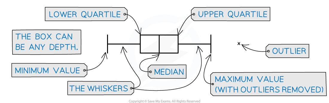
The middle 50% of the data will be represented by the 'box' section of the graph
and the lower and upper 25% of the data will be represented by each of the 'whiskers'
Any outliers are represented with a cross on the outside of the whiskers
If there is an outlier then the whisker will end at the value before the outlier
Only one axis is used when graphing a box plot
It is still important to make sure the axis
has a clear, even scale
and is labelled with units
If you are given a box plot
You can read off the five values
minimum value, lower quartile, median, upper quartile and maximum value
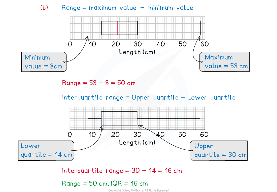
And then calculate other statistics
like the range
or the interquartile range (IQR)
When are box plots used?
Box plots are used when we are interested in splitting data up into quartiles
Often, data will contain extreme values
Consider the cost of a car
There are far more family cars than there are expensive sports cars
If you had 50 data values about the prices of cars
and 49 of them were family cars but 1 was a sports car
the sports car’s value would not 'fit in' with the rest of the data
Using quartiles and drawing a box plot allows us to split the data
We can see what is happening at the low, middle and high points
and consider any possible extreme values
How do I draw a box plot?
You need to know five values to draw a box plot
Lowest data value
or lowest value that is not an outlier
Lower quartile
Median
Upper quartile
Highest data value
or highest value that is not an outlier
Box plots are drawn accurately (usually on graph paper)
The five points are marked by short vertical lines
The middle three values then form a box with the median line inside
The median will not necessarily be in the middle of the box!
The box represents the interquartile range (middle 50% of the data)
The lowest data value and highest data value are joined to the box by horizontal lines
These are the 'whiskers'
They represent the lowest 25% of the data and the highest 25% of the data
Any outliers should be represented by crosses
These will be beyond the ends of the whiskers
How do I compare box plots?
Box plots are often used for comparing two sets of data
Both box plots will be drawn one above the other on the same scale on the x-axis
It is easy to see the main shape of the distribution of the data from a box plot
If you are asked to compare box plots aim for two pairs of comments
The first pair of comments should mention average - i.e. the median
The first comment should compare the value of the medians
e.g. the median for non-club members (12) is greater than the median for club members (8)The second comment should explain it in the context of the question
e.g. the non-club members were, on average, 4 seconds slower than the club members
The second pair of comments should mention spread - i.e. the interquartile range (or range)
The first comment should compare the value of the IQRs
e.g. the IQR for club members (6) is lower than the IQR for non-club members (9)The second comment should explain it in the context of the question
e.g. the club members' times were less spread out than the non-club members, the club members were more consistent
Examiner Tips and Tricks
A box plot is a graph, and like a graph should have
a title
a clear, even scale (labelled with units if there are any)
If drawing two box plots on the same axis
label each one clearly.
Worked Example
The box plot below shows the number of goals scored per game by Albion Rovers during a football season.
The information below shows the number of goals score per game by Union Athletic during the same football season.
Median number of goals per game | 4 |
Lower quartile | 2 |
Upper quartile | 7.5 |
Lowest number of goals per game | 1 |
Highest number of goals per game | 10 |
(a) Draw a box plot for the Union Athletic data.
Draw the box plot by first plotting all five points as vertical lines
Draw a box around the middle three and then draw whiskers out to the outer two
(b) Compare the number of goals scored per game by the two teams.
Your first comment should be about averages - do it in two sentences
Your first sentence should be just about the maths and numbers involved
The second should be about what it means
The median number of goals per game is higher for Union Athletic (4 goals) than Albion Rovers (3 goals).
This means that on average, Union Athletic scored more goals per game than Albion Rovers.
Your second comment should be about spread - do it in two sentences
Your first sentence should be just about the maths and numbers involved
The second should be about what it means
The interquartile range (IQR) is higher for Union Athletic (4) than Albion Rovers (3).
This means that Albion Rovers were more consistent regarding the number of goals they scored per game.
Remember a smaller range/IQR means more consistent which, depending on the situation, may be desirable
Worked Example
The incomplete box plot below shows the tail lengths in cm of some students’ pets.

(a) Given that the median tail length was 21 cm, complete the box plot.

(b) Find the range and interquartile range of the tail lengths.

Unlock more, it's free!
Join the 100,000+ Students that ❤️ Save My Exams
the (exam) results speak for themselves:

Was this revision note helpful?
