Identifying & Interpreting Trends in Data (Edexcel GCSE Statistics: Foundation): Revision Note
Exam code: 1ST0

Trend Lines
How do I draw trend lines on a time series graph?
Time series graphs can go up and down over time
This can make it hard to see what the general trend of the data is
e.g. are things 'on average' tending to increase, decrease, or stay the same over time
A trend line is a line drawn on a time series graph to help identify the general trend
It is possible to draw a trend line by eye directly from a time series graph
In this case the line should go approximately halfway between the lowest and highest points for each cycle (most often the cycle will be a year)
Usually however the trend line will be drawn by eye using moving average points plotted on the time series graph
In this case the trend line is a line of best fit for those moving average points
This is more accurate than simply drawing the line from the raw data points on the time series graph
This should be a single straight line going approximately through the moving average points
It does not mean connecting the moving average points point to point!
Examiner Tips and Tricks
Remember to use a ruler when drawing a trend line
Worked Example
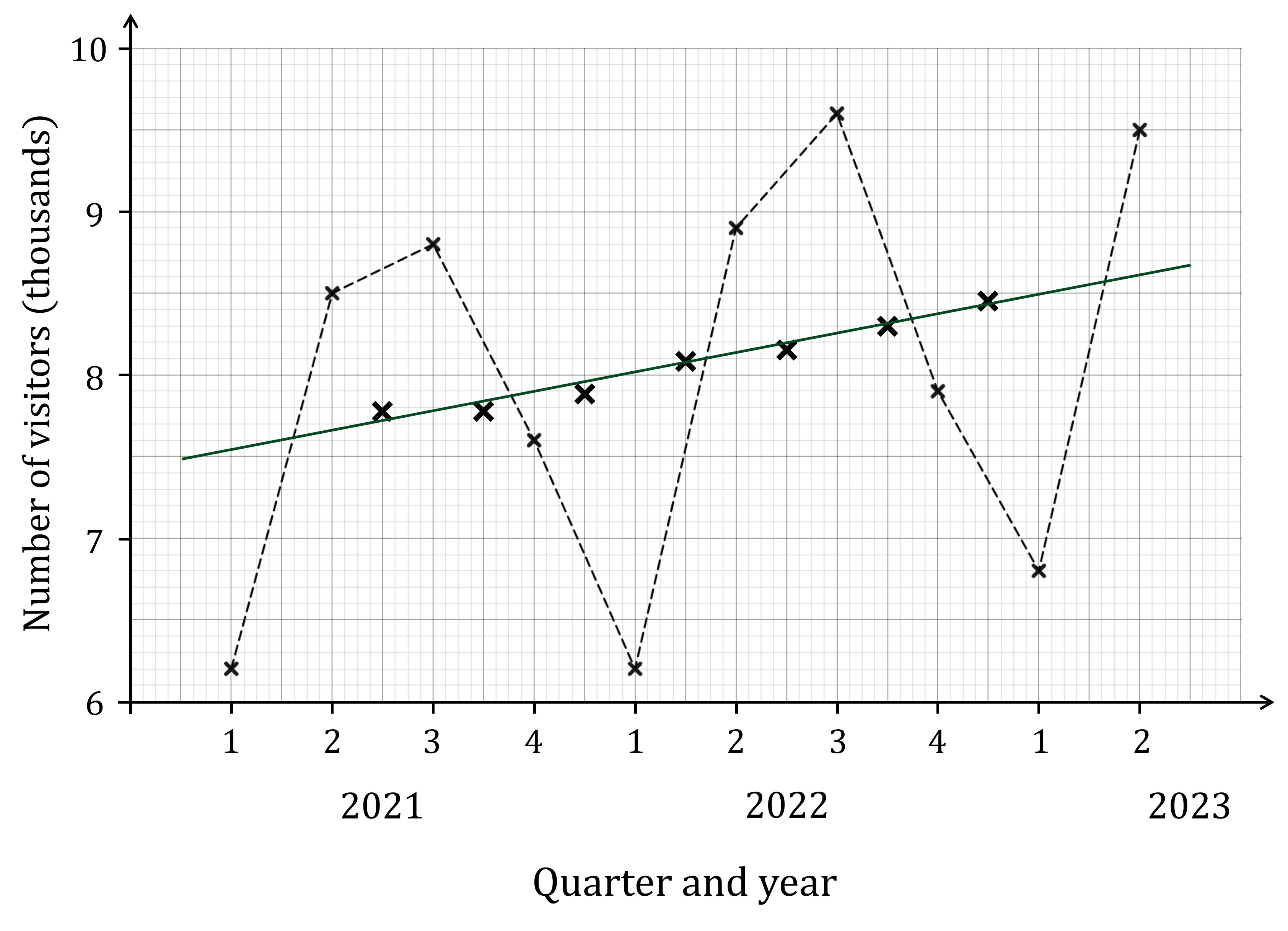
The time series graph shows the number of visitors to Wayne’s World of Widgets for 2021, 2022 and the first two quarters of 2023.

The moving average points for the four point moving averages have also been plotted on the graph.
Draw a trend line on the graph for this data.
The trend line needs to be a straight line that is the line all the moving average points approximately lie along
Remember, it is not drawn by connecting the moving average points point to point!
Trends in Data
What sorts of trends can appear on a time series graph?
There are two types of trend that you should be able to identify and interpret on a time series graph
The general trend is the 'average behaviour' of the data over time
The general trend can be seen from the trend line for the data
If the trend line goes up over time (i.e. has a positive gradient) then we say there is a rising trend
If the trend line goes down over time (i.e. has a negative gradient) then we say there is a falling trend
If the trend line stays the same over time (i.e. is horizontal) then we say there is a level trend
Seasonal or cyclical trends are patterns in the data that repeat over time
For example an ice cream shop may see higher sales every summer and lower sales every winter
Or a town centre restaurant may see higher customer numbers on weekend evenings and lower customer numbers on weekday evenings
These sorts of trends appear as repeating patterns on a time series graph
Examiner Tips and Tricks
When commenting on trends on an exam question be sure to comment in the context of the question
For example don't just say 'There is a rising trend'
But be sure to add something like 'This shows that sales are increasing over time'
Worked Example
The time series graph shows the number of visitors to Wayne’s World of Widgets for 2021, 2022 and the first two quarters of 2023.
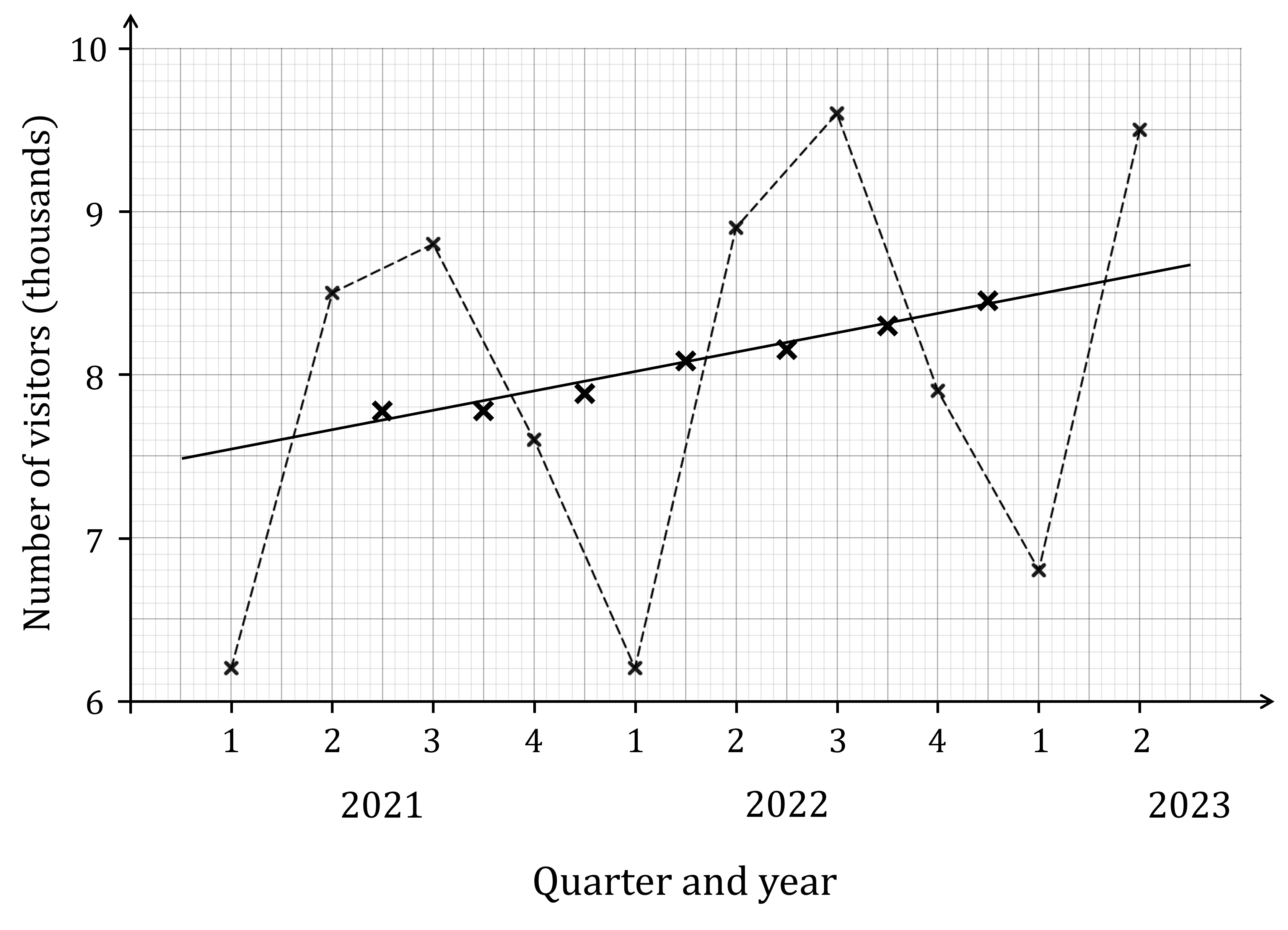
The moving average points for the four point moving averages have also been plotted on the graph, along with the trend line based on those points.
(a) Describe the general trend shown in the data.
The trend line is going up (has a positive gradient), so there is a rising trend
This means visitor numbers are increasing over time
The trend line is going up from left to right, which means there is a rising trend. The number of visitors to Wayne's World of Widgets is tending to increase over time.
(b) Describe the seasonal variations shown in the data, and suggest a reason for why these variations occur.
Note that the visitor numbers each year are higher than the trend line in quarters 2 (April to June) and 3 (July to September), and lower than the trend line in quarters 1 (January to March) and 4 (October to December)
This suggests that more people are visiting in the spring and summer months (while people are on holiday and the weather is nice), and less are visiting in the autumn and winter months (when people are travelling less and the weather isn't as nice)
The numbers of visitors are above the trend line for quarters 2 and 3 each year, and lower than the trend line for quarters 1 and 4 each year. More people are visiting Wayne's World of Widgets in the spring and summer months when the weather is nice and people tend to be on holiday, and less people are visiting in the autumn and winter.

Unlock more, it's free!
Join the 100,000+ Students that ❤️ Save My Exams
the (exam) results speak for themselves:

Was this revision note helpful?
