Pie Charts (Edexcel GCSE Statistics): Revision Note
Exam code: 1ST0
Pie Charts
What is a pie chart?
A pie chart is a circle which is divided into slices (sectors) to show proportions
They show the relative size of categories of data compared to each other
rather than their actual size or number
e.g. looking at the proportions of men and women working for a company, we might be more interested in the relative sizes of the groups than in the actual numbers of men and women
There are 360° in a circle
We can use this to help us calculate the size of each slice of the pie chart
How do I draw a pie chart?
This is shown easiest through an example
The following data is collected for a class of 30 students about their favourite colour
Colour | Red | Purple | Blue | Green | Yellow | Orange |
Students | 11 | 4 | 9 | 3 | 2 | 1 |
STEP 1
Find the number of degrees that represents 1 studentThere are 30 students in total, so 360° = 30 students
Divide both sides by 30, so 12° = 1 student
STEP 2
Calculate the angle for each category by finding a fraction of 360°11 students out of 30 said red was their favourite colour,
so this is
4 students out of 30 said purple,
so this is
Repeat this for each category, they should sum to 360° in total
Colour | Red | Purple | Blue | Green | Yellow | Orange |
Students | 11 | 4 | 9 | 3 | 2 | 1 |
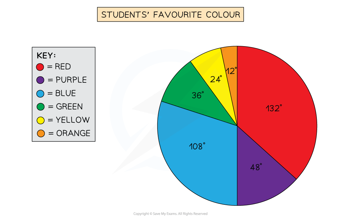
Angle | 132° | 48° | 108° | 36° | 24° | 12° |
STEP 3
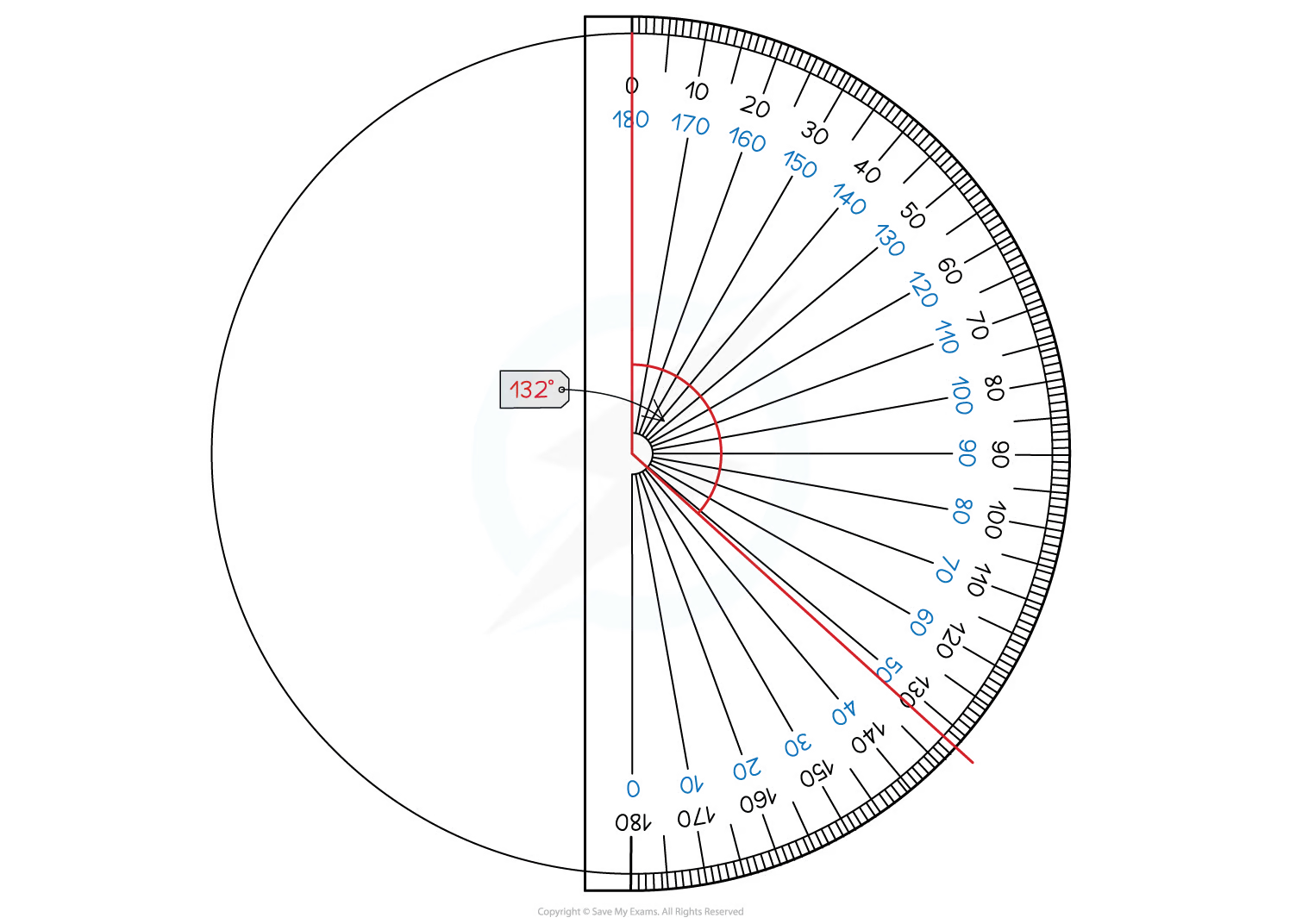
Draw the pie chart, using a protractor to measure the anglesStart by drawing a vertical line from the centre of the circle to the top ("12 o'clock")
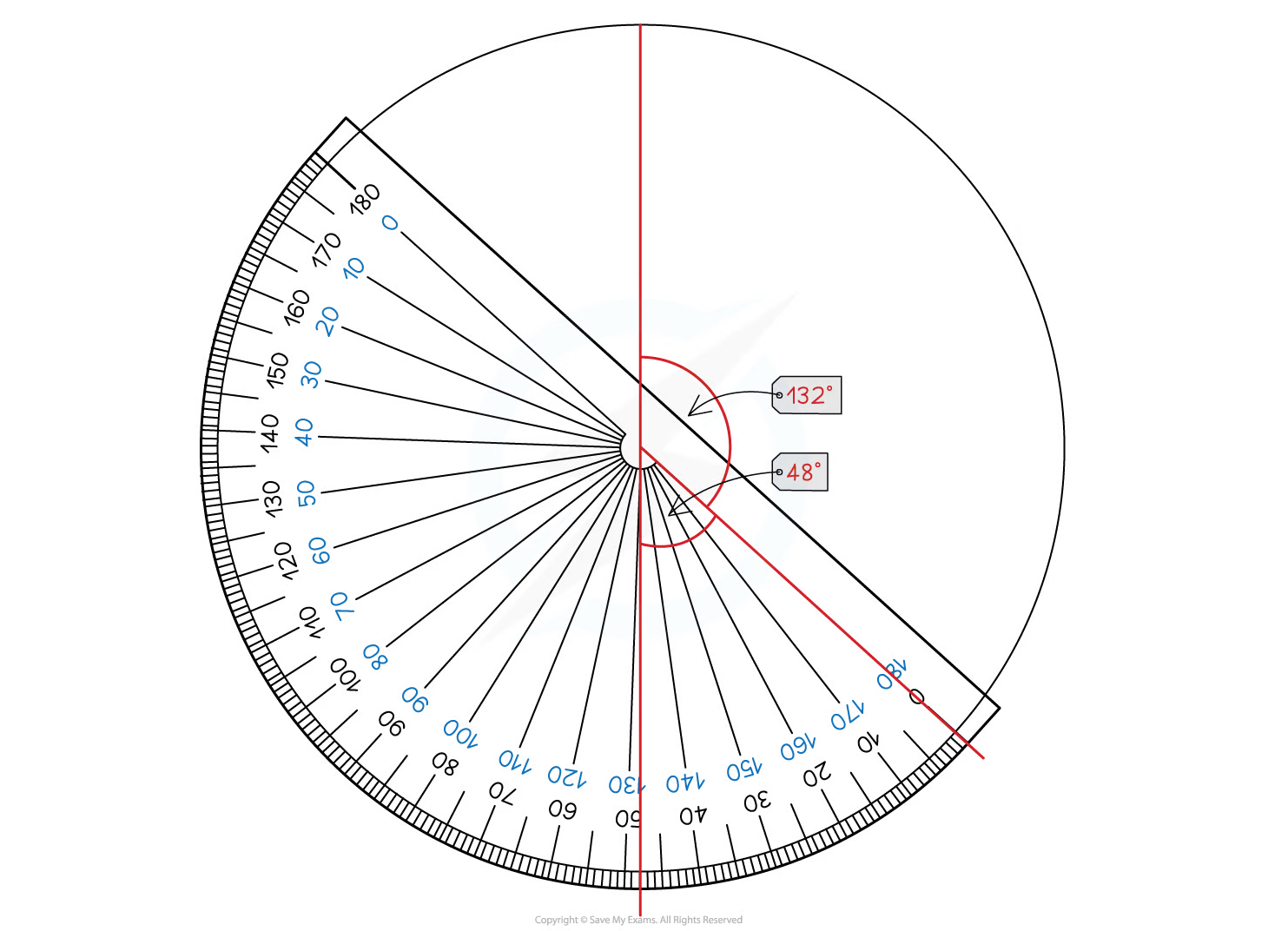
Then use your protractor to measure the first angle and draw a line to this point
Move your protractor to this line, and repeat for the next category
Continue until the slices for all the categories are drawn
You should include a key or labels to show which slice represents which category


How do I interpret a pie chart or find missing information?
It is easy to spot from a pie chart which category is the largest or smallest proportion
But you may be asked to do something more advanced like finding some missing information
Remember that all of the data is represented by 360°
You can use the information you are given to find
how many degrees each person/piece of data is represented by
how many people/pieces of data 1 degree represents
For example if you are told that there is a slice measuring 30° which represents 15 people
30° = 15 people
1° = 0.5 people (divide by 30)
2° = 1 person (divide the first statement by 15, or double the second statement)
You can then use this information to help solve problems or find missing information
Examiner Tips and Tricks
A pie chart given in an exam may not be to scale
If it is not to scale, do not try to use your protractor to measure it!
Instead use the methods described in this revision note to calculate the information you need
Worked Example
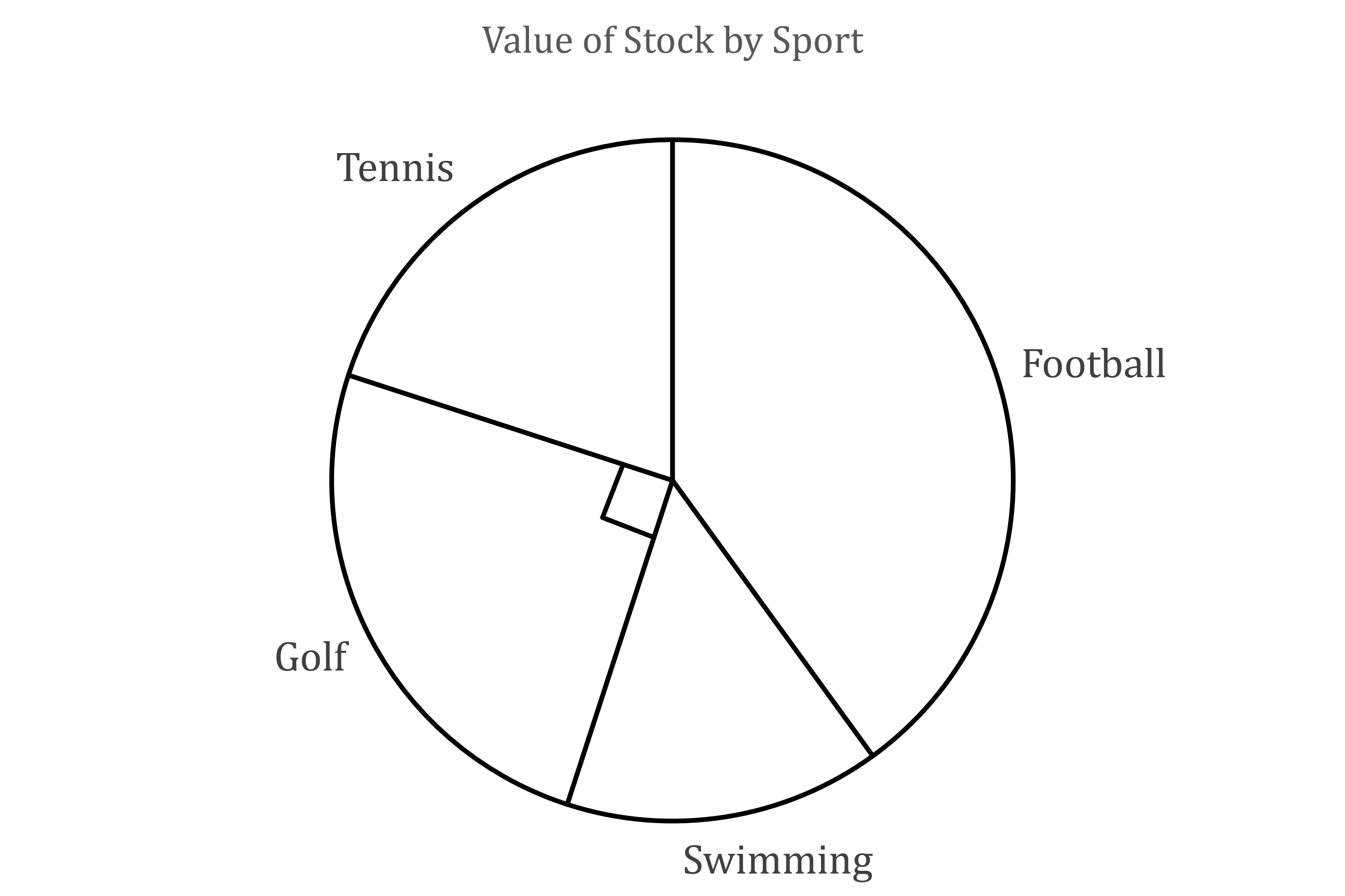
The following pie chart is created to show the total value of items stocked in a sports shop for 4 different sports.

(a) Using the angle marked on the pie chart, and the fact that the shop stocks $12 000 worth of Golf items, find the total value of the shop’s stock across the 4 sports.
The angle marked on the diagram is 90°
So a quarter of the stock is for golf
That means we can multiply the value of the golf stock by 4 to find the total value of the shop’s stock
Total value is $48 000
(b) Given that the angle on the pie chart for Tennis is 72°, find the value of the Tennis items that the shop stocks.
The fraction of the value of the shop’s stock will be the same as the fraction of the circle for each category
Therefore the value of tennis items will be
Value of tennis items is $9 600

You've read 0 of your 5 free revision notes this week
Unlock more, it's free!
Did this page help you?