Histograms & Frequency Polygons (Edexcel GCSE Statistics): Revision Note
Exam code: 1ST0

Frequency Polygons
What is a frequency polygon?
Frequency polygons are a very simple way of showing frequencies for continuous, grouped data
They give a quick guide to how frequencies change from one class interval to the next
What are the key features of a frequency polygon?
Apart from plotting and joining up points with straight lines there are 3 rules for frequency polygons:
Plot points at the midpoint of class intervals
Unless one of the frequencies is 0 do not join the frequency polygon to the x-axis
Do not join the first point to the last one
The result is not actually a polygon
It's more of an 'open' polygon that ‘floats’ in mid-air!
You may be asked to draw a frequency polygon and/or use it to make comments and compare data
How do I draw a frequency polygon?
This is most easily shown by an example
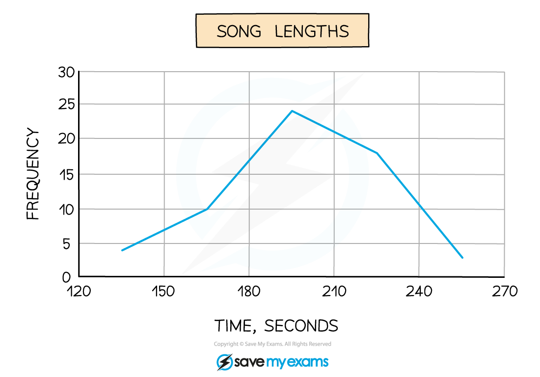
e.g. The lengths of 59 songs, in seconds, are recorded in the table below
Song length | Frequency |
120 ≤ t < 150 | 4 |
150 ≤ t < 180 | 10 |
180 ≤ t < 210 | 24 |
210 ≤ t < 240 | 18 |
240 ≤ t < 270 | 3 |
Frequencies are plotted at the midpoints of the class intervals, so in this case we would plot the points (135, 4), (165, 10), (195, 24), (225, 18) and (255, 3).
Join these up with straight lines (but do not join the last to the first!)
If you have a histogram with equal class widths
then a frequency polygon can be drawn
by marking the points at the centres of the tops of all the histogram bars
and joining those points together to make the 'polygon'
How do I use and interpret a frequency polygon?
Think about what you could you say about the data above, particularly by looking at the diagram only
The two things to look for are averages and spread
The modal class is 180 ≤ t < 210
Because the graph reaches its highest point there
It would be acceptable to say that 195 seconds is (an estimate of) the modal song length
The diagram (rather than the table) shows (an estimate of) the range of song lengths is 255 – 135 = 120 seconds
i.e. midpoint of highest class interval minus midpoint of lowest class interval
If 2 frequency polygons are drawn on the same graph comparisons between the 2 sets of data can be made
Examiner Tips and Tricks
Jot down the midpoints next to the frequencies so you are not trying to work them out in your head while also concentrating on actually plotting the points
Worked Example
A local council ran a campaign to encourage households to waste less food.
To compare the impact of the campaign the council recorded the weight of food waste produced by 30 households in a week both before and after the campaign.
The results are shown in the table below.
Food waste | Frequency | Frequency |
1 ≤ w < 1.4 | 3 | 5 |
1.4 ≤ w < 1.8 | 4 | 8 |
1.8 ≤ w < 2.2 | 8 | 14 |
2.2 ≤ w < 2.6 | 10 | 3 |
2.6 ≤ w < 3 | 5 | 1 |
(a) On the same diagram, draw two frequency polygons, one for before the council’s campaign and one for after.
Remember to include a key to show which frequency polygon is which.
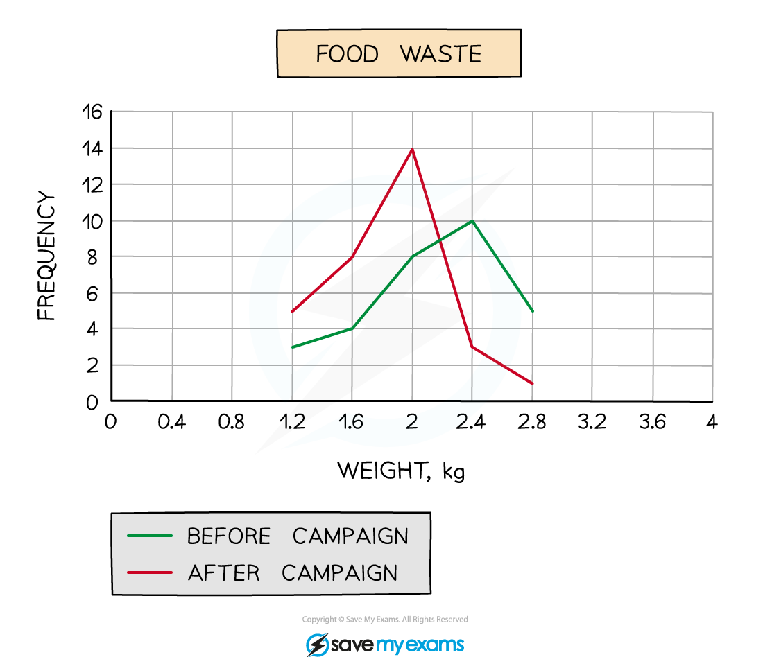
(b) Comment on whether you think the council’s campaign has been successful or not and give a reason why.
Remember to look for average(s) and/or spread
The mode (average) is appropriate in this case.
The council campaign has been successful as the modal amount of waste has decreased from 2.4 kg of food waste per week to 2 kg
Histograms
What is a histogram?
A histogram is similar to a bar chart, but there are important differences
Bar charts are used for discrete (and possibly non-numerical) data
In a bar chart, the height (or length) of a bar determines the frequency
There are usually gaps between the bars
Histograms are used with continuous data, grouped into class intervals
If the class intervals are of equal width then the height of a bar indicates the frequency
But there are no gaps between the bars
Note that the situation is much more complex for histograms with unequal class widths
But these are not included on your Foundation course
How do I draw a histogram?
If you know the frequencies and class boundaries, then the bars (rectangles) for each class interval can be drawn
The class boundaries are marked on the horizontal (x) axis
The height of each bar (the frequency) is measured on the vertical (y) axis
As the data is continuous, the bars will be touching (no gaps)
What else can I be asked to do with a histogram?
You may be asked to complete an incomplete histogram using information from a grouped frequency table
Just draw in the missing bars based on the information in the table
You may be asked to complete an incomplete grouped frequency table using information from a histogram
Use the information from the histogram bars to complete the table
The class boundaries can be read off the horizontal axis
The frequencies can be read off the vertical axis
You may be asked to draw a frequency polygon on the histogram
Mark the points at the centres of the tops of all the histogram bars
Join those points together to make the 'polygon'
You may be asked to comment on the skew shown on a histogram
See the 'Skewness' revision note
You can also use histograms for two data sets to compare the data distributions
but only if they have the same class intervals and the same frequency scales
Examiner Tips and Tricks
Remember that there should not be any gaps between the bars on a histogram
Leaving gaps can lose you marks
Worked Example
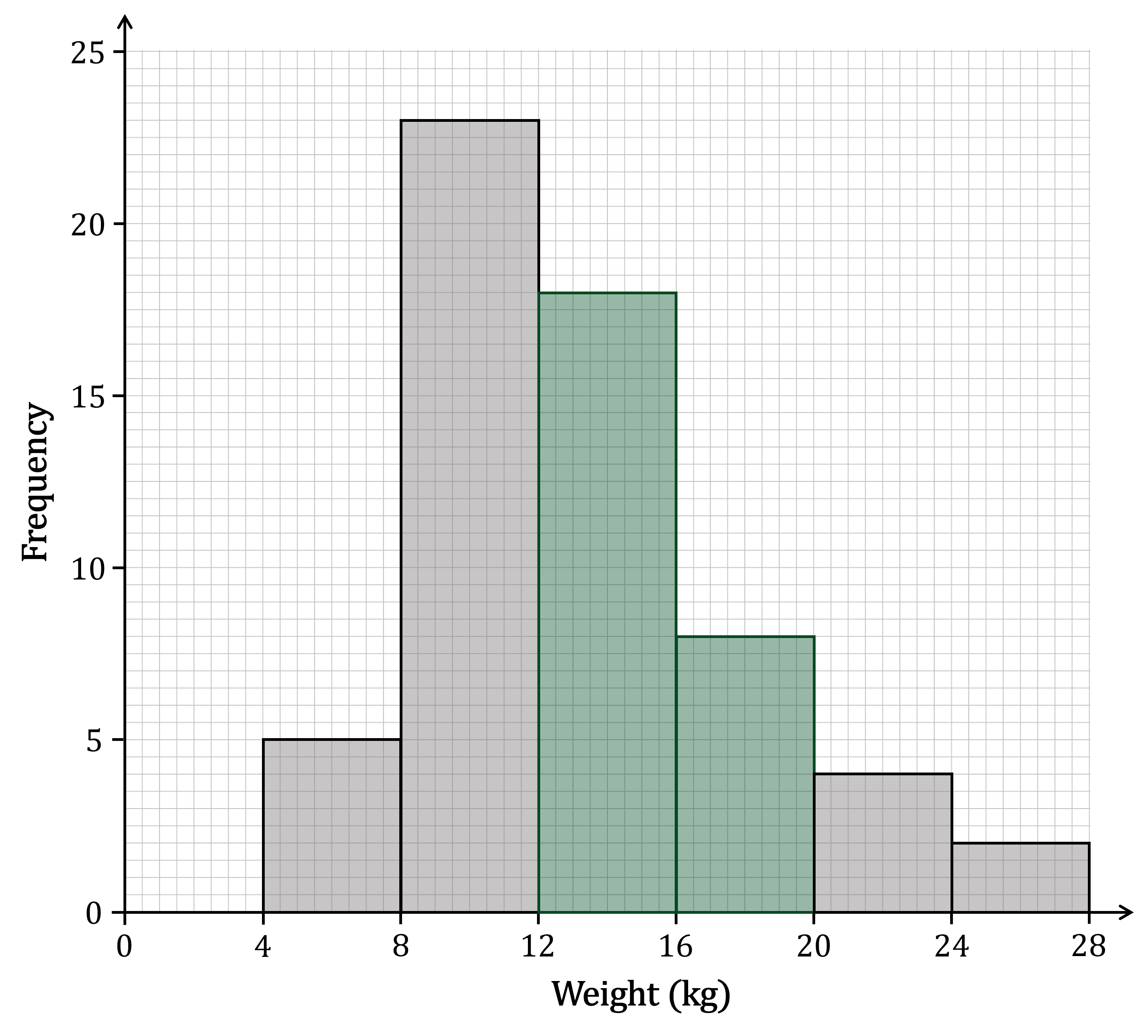
The table below and the corresponding histogram show the weight, in kg, of some newborn bottlenose dolphins.
Weight (w kg) | Frequency |
|---|---|
4 ≤ w < 8 | 5 |
8 ≤ w < 12 | 23 |
12 ≤ w < 16 | 18 |
16 ≤ w < 20 | 8 |
20 ≤ w < 24 | |
24 ≤ w < 28 |
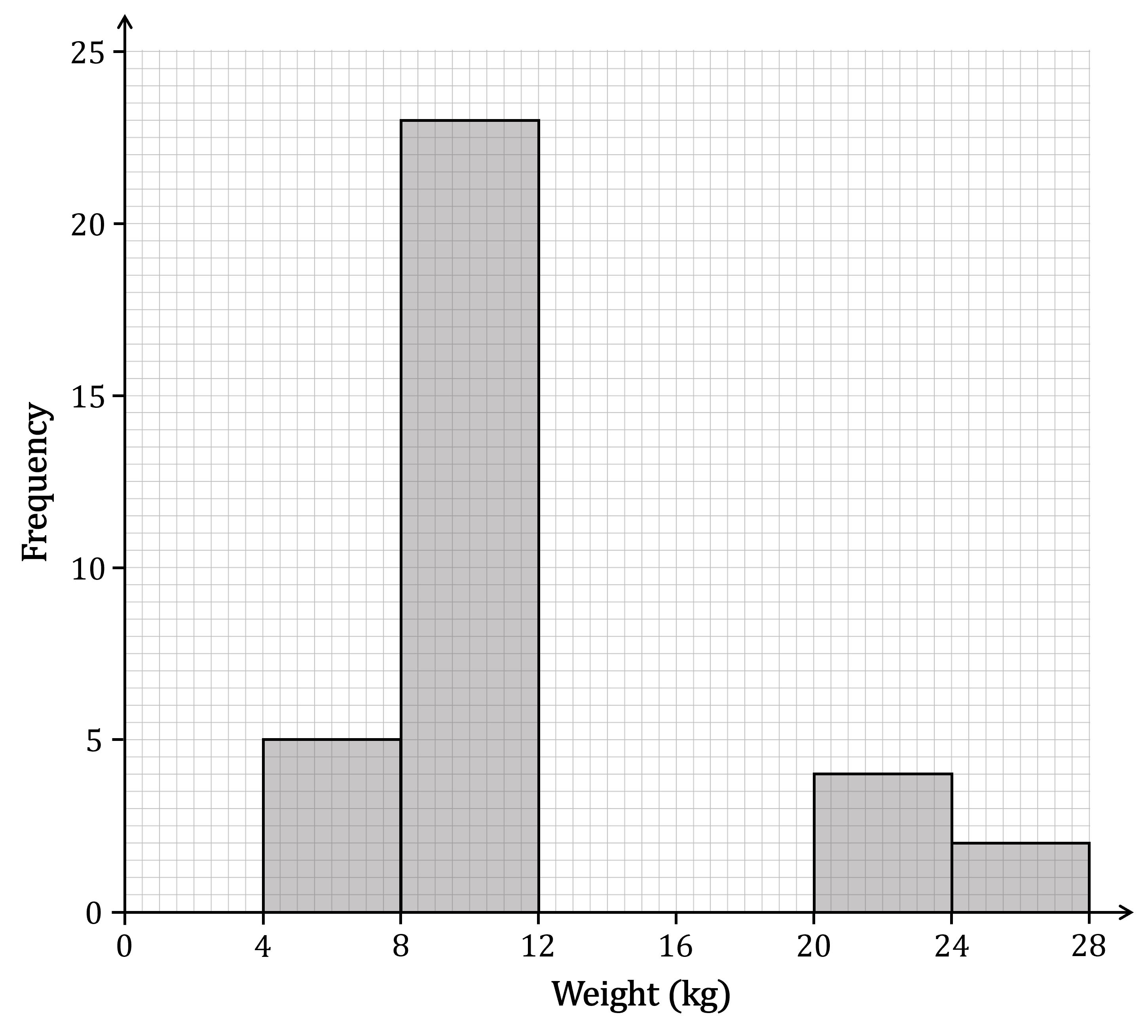
(a) Use the histogram to complete the table.
The frequencies for the 20 ≤ w < 24 and 24 ≤ w < 28 class intervals are missing
These can both be found from the heights of the bars, using the vertical scale on the diagram
Weight (w kg) | Frequency |
|---|---|
4 ≤ w < 8 | 5 |
8 ≤ w < 12 | 23 |
12 ≤ w < 16 | 18 |
16 ≤ w < 20 | 8 |
20 ≤ w < 24 | 4 |
24 ≤ w < 28 | 2 |
(b) Use the table to complete the histogram.
The bars for the 12 ≤ w < 16 and 16 ≤ w < 20 class intervals are missing
We can get the frequencies for these from the table
The bar for the 12 ≤ w < 16 class interval should have a height of 18, and go between 12 and 16 on the horizontal axis
The bar for the 16 ≤ w < 20 class interval should have a height of 8, and go between 16 and 20 on the horizontal axis
Make sure not to leave any gaps between the bars

Unlock more, it's free!
Join the 100,000+ Students that ❤️ Save My Exams
the (exam) results speak for themselves:

Was this revision note helpful?
