Interpretation of Data (AQA GCSE Sociology): Revision Note
Exam code: 8192
Analysing statistical data
When presenting numerical data, graphs and charts are frequently used, especially when demonstrating trends
A trend refers to the general direction in which statistics move
E.g. the number of marriages or divorces may change
The trend could be rising, falling, or fluctuating (changing up and down a lot)
Bar charts
Data can be represented visually using a bar chart
The data shown on the x-axis of a bar chart is discrete (not continuous), such as
A-level exam entries by gender
'yes' or 'no' answers ticked on a survey
Bar charts have gaps between each category on the x-axis (unlike histograms)
The x-axis shows the categories, such as gender or time period
The y-axis shows the frequency in terms of score, number or percentage

Worked Example
Here is an example of an application (AO2) question that requires the interpretation of data:

Describe the type of statistical data shown in the item above. Identify the trend shown by the data and explain one factor which may account for this trend.
[4 marks]
Model Answer:
Describe the type of data in the context of the question:
Official statistics showing the number of divorces recorded in England and Wales [1 mark]
Identify the trend shown in the item:
The trend is increasing (since 1970) [1 mark]
Explain one factor that accounts for the trend in the context of the question:
This could be due to secularisation, which is the declining importance of religion in society, as fewer people have religious objections to divorce [2 marks]
Line graphs
Line graphs are used to represent quantitative data collected on a topic over a specific time period
They are used to represent changes that have occurred over a given period of time
The x-axis usually has a time period over which we would like to measure something
The y-axis shows the frequency in terms of score, number or percentage
A line graph gives a clear picture of an increasing or decreasing trend

Worked Example
Here is an example of an application (AO2) question that requires the interpretation of data:

Describe the type of statistical data shown in the item above. Identify the trend shown by the data and explain one factor which may account for this trend.
[4 marks]
Model Answer:
Describe the type of data in the context of the question:
Official statistics showing the number of cohabiting couple families in the UK [1 mark]
Identify the trend shown in the item:
The trend is increasing [1 mark]
Explain one factor that accounts for the trend in the context of the question:
This could be due to changing social attitudes, as cohabitation nowadays is seen as more socially acceptable within some social groups than it was in the past [2 marks]
Pie charts
A pie chart provides a visual representation of all items of data within a data set
The various items in the data set are represented by the sectors (or slices) of a pie chart; the larger the sector, the more frequently that category of data occurs
Pie charts are used to represent categorical data, such as the different family types in the UK or the different types of crime committed in the UK
Pie charts are a simple way of presenting data, as each category is easily comparable

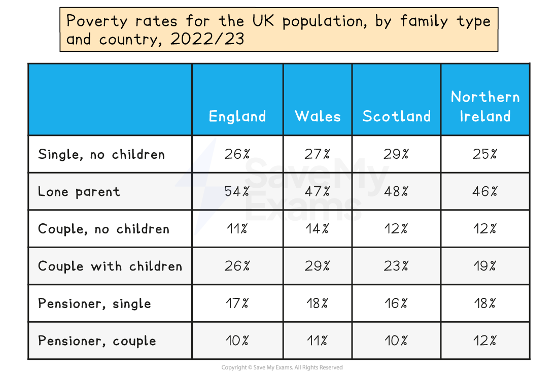
Tables
Once quantitative data has been collected and organised, it may be placed in a table
This involves arranging information systematically into rows and columns, providing a structured format for presenting numerical data
Tables are a simple way of presenting data so that comparisons can be made and conclusions can be drawn
Tables tend to be the most common method for presenting analysed data

Worked Example
Here is an example of an application (AO2) question that requires the interpretation of data:

The Crime Survey for England and Wales (CSEW) is a large-scale victim survey, conducted by the government since 1981. It measures the amount of crime in England and Wales by asking people about the crimes they have experienced during the past year. The sample size is approximately 50,000 respondents.
Describe the type of survey shown in the item above. Identify the age groups most likely to be victims of crime and explain one factor which may account for this.
[4 marks]
Model Answer:
Describe the type of survey in the context of the question:
A victim survey - the CSEW [1 mark]
Identify the age group most likely to be a victim of crime as shown in the item:
16-24 year olds are most likely to be victims of crime [1 mark]
Explain one factor that accounts for this in the context of the question:
One reason for this is because younger people are more likely to be in the areas where crimes are committed and out at times when they occur [2 marks]

You've read 0 of your 5 free revision notes this week
Unlock more, it's free!
Did this page help you?