Correlations (AQA GCSE Psychology): Revision Note
Exam code: 8182

Co-variables
A correlation is not a research method, it is an analysis of the possible relationship between co-variables
In correlational research, the variables are not manipulated (i.e. there is no IV), instead two co-variables are measured and compared to look for a relationship
One or both of the co-variables could be pre-existing, e.g.
School attendance measured as days present at school in Year 11 (co-variable) and number of GCSEs achieved (co-variable)
Average temperature in August (co-variable) and number of arrests made for violent behaviour in August in one town
One or both of the co-variables could be measured for the research itself, e.g.
Number of takeaway meals consumed in a month (co-variable) and self-reported stress levels for the same month (co-variable)
Average number of hours sleep in one week (co-variable) and number of cups of caffeinated beverages consumed in the same week (co-variable)
A correlation uses two scores e.g. number of cups of caffeine and the number of hours of sleep
In the case of self-reported data there are two scores per participant e.g. an average of 4 hours of sleep per night correlated with 58 cups of caffeine consumed in a week
In the case of pre-existing data the researcher would simply go to the records e.g. Student X was present for 188 days in Year 11 - they achieved 10 GCSEs
Examiner Tips and Tricks
You may be asked to plot the points on a scatter diagram in the exam (there is a practice question for you to try below) so make sure that you have done this a few times before the exam (make up your own data, you don’t need to go searching for past questions).
Types of correlation & scatter diagrams
There are three types of correlation:
Positive correlation: One co-variable increases as does the other (but not necessarily at the same rate) e.g. calories consumed and weight gained
Negative correlation: One co-variable increases while the other co-variable decreases (but not necessarily at the same rate) e.g. hours spent watching television and level of fitness
Zero correlation: There is no relationship between the variables e.g. hair colour and IQ
Correlations are plotted as one point on a scatter diagram and the direction of the ‘line of best fit’ indicates what type of correlation there is between the two variables:
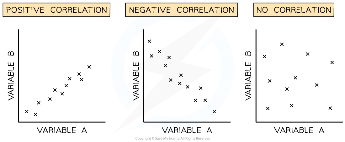
Scatter diagrams and the type of correlation shown on each.
Analysing the relationship between co-variables can be done either with a scattergraph visually or by calculating the correlation coefficient which is expressed as a numerical value
The correlation coefficient represents both the direction (i.e. positive or negative) and strength of the relationship between the variables, expressed as a value between -1 and +1
A perfect positive correlation is expressed as +1
A perfect negative correlation is expressed as -1
No relationship is expressed as 0
Both positive and negative coefficient correlations can be described as weak, moderate or strong e.g. a correlation coefficient of 0.2 is a weak positive correlation; a correlation coefficient of -0.8 is a strong negative correlation
Evaluation of correlations
Strengths
Correlations show a relationship between variables which can be a good starting point for further research e.g. if take-away meals show a positive correlation with stress then this could inform research projects into combatting the downsides of convenience foods
The data can be analysed quickly, particularly if it is pre-existing data
Weaknesses
Correlations cannot show cause and effect so it is unclear, e.g., why a high consumption of take-away food is linked to high stress
Extraneous relationships with other variables may affect the co-variables e.g. number of days absence from school may be due to illness rather than to choice
Worked Example
Here is an example of a question you might be asked on this topic - for AO2.
AO2: You need to apply your knowledge and understanding, usually referring to the ‘stem’ in order to do so (the stem is the example given before the question)
Dr Ronaldmcdonald is interested in a possible relationship between burgers consumed in a month and concentration on a task. He asks participants to report how many burgers they have consumed in the previous month then he sets them a timed task (identifying the number of times the letter ‘b’ appears in a piece of text). The scores per co-variable are shown in the table below:
Participant | Number of burgers eaten | Score on concentration task |
A | 15 | 10 |
B | 1 | 41 |
C | 37 | 5 |
D | 8 | 30 |
E | 22 | 17 |
Question: Use the graph paper (this will be provided in the exam, obviously we can’t give you graph paper for this practice question) below to sketch a scatter diagram of the results shown in the table above.
Provide a suitable title and labels for your diagram. [4]
Model answer:
Informative title (1 mark)
Correct labelling of both axes (1 mark)
Correct scaling of both axes (1 mark)
Correct plotting of the results (1 mark)
NOTE: If the graph is not a scatter diagram, you will be awarded 0 marks.
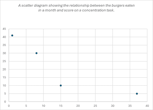
Number of burgers eaten = X axis Score on a concentration task = Y axis |

Unlock more, it's free!
Join the 100,000+ Students that ❤️ Save My Exams
the (exam) results speak for themselves:

Was this revision note helpful?