Population Composition & Modelling (DP IB Environmental Systems & Societies (ESS): HL): Revision Note

Human population models
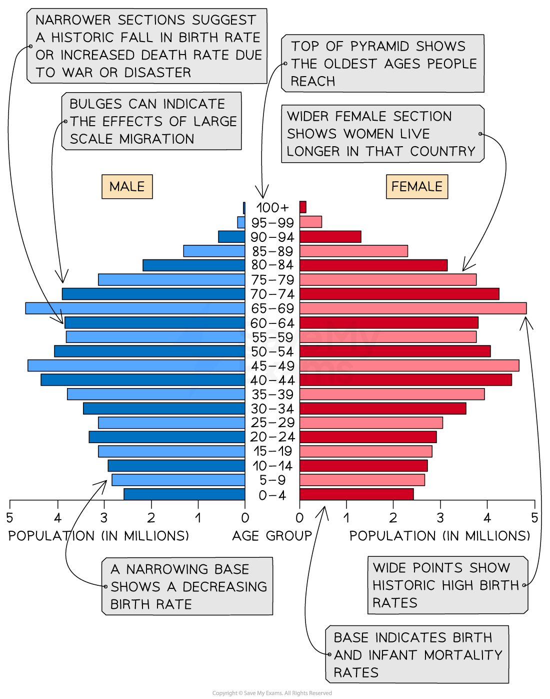
Age-sex pyramids
The composition of human populations can be modelled and compared using age–sex pyramids
These are sometimes referred to as population pyramids, age-gender pyramids or age structure diagrams
An age–sex pyramid is a graphical representation of a population's age and sex structure
It displays the percentage or number of individuals in each age group and gender within a given population
They typically show data for a particular country or region
The age–sex pyramid is usually represented as a horizontal bar graph
The age groups are displayed along the vertical axis
The percentage or number of individuals in each age group is displayed along the horizontal axis
The left side of the graph displays the male population
The right side shows the female population
The shape of the age–sex pyramid can provide insights into the demographic characteristics of a population
For example, a pyramid with a broad base and a narrow top indicates a young population with high fertility rates and low life expectancy
Whereas a pyramid with a narrow base and a broad top indicates an ageing population with low fertility rates and high life expectancy
Age–sex pyramids are used by policymakers and economists to:
Understand population trends
Forecast future population growth
Plan for social and economic policies
They are also used in fields such as public health, education and social welfare to plan for the needs of specific age groups within a population
This means that governments can estimate and plan for spending
An age–sex pyramid can be used to identify the following groups:
Young dependents
Old dependents
Economically active (working population)
Population structures of LICs and HICs

Low-income countries (LICs) like Niger typically have a concave pyramid shape
This indicates:
High birth rate
Low life expectancy
High death rate
High infant mortality rate
Young dependent population dominates

More developed LICs like Nepal typically have a pyramid shape with a taller base, like the one shown above
This indicates:
Decreasing birth rate
Increasing life expectancy
Decreasing death rate
Decreasing infant mortality
Decreasing young dependents and increasing economically active population

High-income countries (HICs) such as the USA typically have a column shape
This indicates:
Low birth rate
High life expectancy
Low death rate
Low infant mortality
Large working age population
Worked Example
An age–sex pyramid is shown below.
What does the shape of the pyramid tell you about the population structure of the country?

Answer
The narrow base means a low birth rate
A low birth rate means a low number of young dependents
A reasonably broad top means high life expectancy
The majority of the population is between 40 and 60
This means there will be a large number of elderly dependents in the future
Worked Example
The figure below shows age–sex pyramids for Mexico in 1980 and 2010.
Describe the changes in Mexico's population structure between 1980 and 2010.

Answer
In 2010 there are:
More economically active / working / 15-64 year-olds
More elderly / old dependents / 65+ year-olds
More young dependents in total / bands up to 19 become more even
Examiner Tips and Tricks
Remember—when interpreting an age–sex pyramid, you need to look at four key areas:
Younger population - is the birth rate high or low?
Working population - are there enough people of working age to support the young and old dependents?
Elderly population - is it large or small? (if it is large, then life expectancy is high)
Male/female split - are there any noticeable differences between the numbers of males and females?
Demographic transition model (DTM)
The DTM is a model that shows how a population transitions over time:
From a pre-industrial stage, with high crude birth rates and high crude death rates
To an economically advanced stage, with low or declining crude birth rates and low crude death rates
The DTM illustrates five generalised stages that countries pass through as they develop
It shows how the birth and death rates change and how this affects the overall population of the country

Stage 1
The total population is low
High birth rates due to lack of contraception and family planning
High death rates due to poor healthcare, poor diet and famine
High infant mortality, which leads people to have more children so that some children survive to adulthood
Stage 2
The total population starts to rise rapidly
Birth rates remain high as people continue to have large families
Death rates decrease as a result of improved diets, better healthcare, lower infant mortality and increased access to clean water
Stage 3
The total population continues to increase but the rate of growth begins to slow
Birth rate begins to fall rapidly due to increased birth control, family planning, increased cost of raising children and low infant mortality rate
Death rate still decreasing but at a slower rate as improvements in medicine, hygiene, diet and water quality continue
Stage 4
The total population is high and is increasing slowly
Birth rate is low and fluctuating due to accessible birth control and the choice of having fewer children as well as delaying the age women start to have children
Death rate is low and fluctuating
Stage 5
The total population starts to slowly decline as the death rate exceeds the birth rate
Birth rate is low and slowly decreasing
Death rate is low and fluctuating

Unlock more, it's free!
Join the 100,000+ Students that ❤️ Save My Exams
the (exam) results speak for themselves:

Was this revision note helpful?
Build on this topic