Descriptive Statistics (DP IB Business Management): Revision Note
Mean, median and mode
Simple statistical analysis may include calculating the average of a given set of numerical data, using one of three methods
The mean is commonly considered the true average - where all the numbers in a data set are added and then divided by the number of numbers
The median is the middle value in the list of numbers
The mode is the value that occurs most often in a set of data
Worked Example
RapidKleen kept a record of mobile vehicle valets carried out each day during a busy holiday period.
Find the mean, median, mode, and range of mobile valets during the period using the following data:
Day | 1 | 2 | 3 | 4 | 5 | 6 | 7 |
|---|---|---|---|---|---|---|---|
|
|
|
|
|
|
|
|
[6 marks]
Answer:
Step 1: To calculate the mean, first add together each of the values
14 + 10 + 12 + 12 + 14 + 15 + 14 = 91
Step 2: Divide the total by the number of values
91 ÷ 7 = 13 [2 marks]
Note that the mean in this case isn't a value from the original data set
This is a common result - you should not assume that your mean will be one of your original numbers and you should not be surprised when it isn't
Step 3: To calculate the median first rewrite the data set in numerical order
10, 12, 12, 14, 14, 14, 15
Step 4: Identify the middle number
There are seven numbers in the list, so the middle one will be the (7 + 1) ÷ 2 = 8 ÷ 2 = 4th number:
10, 12, 12, 14, 14, 14, 15
So the median is 14 [2 marks]
Note: The formula for the place to find the median is "([the number of data points] + 1) ÷ 2", but you don't have to use this formula
You can just count in from both ends of the list until you meet in the middle if you prefer, especially if the data set is small
Step 5: To calculate the mode rewrite the data set in numerical order
10, 12, 12, 14, 14, 14, 15
Step 6: Identify the number that occurs most often in the list
14 occurs three times
14 occurs x3
12 appears x2
10 appears x1
15 appears x1
As it appears most frequently, the mode number of valets sold is 14 [2 marks]
Standard deviation
The standard deviation is a measure of the spread of numbers within a set of data
It is a particularly useful tool for planning when managers have wide ranges of data and need to organise resources effectively
Worked Example
FreshBite is a pre-packaged sandwich manufacturer which produces a range of products that are sold in cafés and refreshment stands in tourist attractions such as theme parks.
Freshbite's sales are highly variable - the business regularly suffers from high levels of wastage as a result of having large quantities of unsold stock. On several occasions it has also been unable to fulfil orders from customers as it has not produced enough units.
The business has recently employed a new operations manager who has suggested that calculating the standard deviation of sales would aid planning. He has requested the last month's sales data to allow him to calculate this.
Product | Last month's sales ($) |
|---|---|
A | 110,000 |
B | 27,000 |
C | 12,000 |
D | 54,000 |
E | 7,000 |
Calculate the standard deviation of last months' sales for Freshbite.
[4]
Step 1: Calculate the mean
110,000 + 27,000 + 12,000 + 54,000 + 6,000 = 210,000
210,000 ÷ 5 = 42,000 [1 mark]
Step 2: For each product, subtract the mean and square the result
Product | Last month's sales ($000s) | Minus mean = | Squared = |
|---|---|---|---|
A | 110 | 68 | 4,624 |
B | 27 | -15 | 225 |
C | 12 | -30 | 900 |
D | 54 | 12 | 144 |
E | 7 | -35 | 1,225 |
[1 mark]
Step 3: Add up the squared differences and express in an expanded form
4,624 + 225 + 900 + 144 + 1,225 = 7,118
= 7,118,000 [1 mark]
Step 4: Find the square root to identify the standard deviation
[1 mark]
Note - in this instance, a significant standard deviation from the mean informs Freshbite's managers that they need to carefully plan for significant variations in sales. This may include detailed market research as well as capital investment to reduce wastage (for example, further freezers).
Quartiles
Quartiles are the values that divide a list of numbers into quarters
Analysis of data using quartiles allows a business to see the distribution and spread of data
The first quartile is the lower 25% of a list of numbers
The second quartile is the lower 50% of a list of numbers
The third quartile is the lower 75% of a list of numbers
The top quartile is the highest 25% of a list of numbers
The interquartile range excludes outlying data in the top and bottom quartiles and examines the middle spread of data
Application of quartile ranges to a set of data
First Quartile |
| ||||||
|---|---|---|---|---|---|---|---|
Second Quartile |
| ||||||
Third Quartile |
| ||||||
| Top Quartile | ||||||
| Interquartile Range |
| |||||
3 | 3.5 | 4.5 | 5 | 6 | 6.5 | 7.5 | 8 |
Worked Example
BestGrip is shoe manufacturing business that employs a team of sales managers who receive performance-related monthly bonuses on top of their monthly salaries.
Bonuses are awarded to those sales managers who achieve sales in the top quartile.
Sales data for the month of May are shown in the table below.
Salesperson | Volume of Sales |
|---|---|
A | 24,300 |
B | 25,350 |
C | 26,650 |
D | 22,100 |
E | 26,200 |
F | 27,800 |
G | 22,950 |
H | 28,450 |
I | 23,750 |
J | 29,200 |
K | 27,350 |
L | 27,900 |
Identify the sales managers to be awarded a bonus in May.
[4]
Step 1: Put the list of data into order, from smallest to largest
Salesperson | Volume of Sales |
|---|---|
D | 22,100 |
G | 22,950 |
I | 23,750 |
A | 24,300 |
B | 25,350 |
E | 26,200 |
C | 26,650 |
K | 27,350 |
F | 27,800 |
L | 27,900 |
H | 28,450 |
J | 29,200 |
[2 marks]
Step 2: Divide the list into four equal parts:
Salesperson | Volume of Sales |
|
|---|---|---|
D | 22,100 | Quartile 1 |
G | 22,950 | |
I | 23,750 | |
A | 24,300 | Quartile 2 |
B | 25,350 | |
E | 26,200 | |
C | 26,650 | Quartile 3 |
K | 27,350 | |
F | 27,800 | |
L | 27,900 | Quartile 4 |
H | 28,450 | |
J | 29,200 |
[1 mark]
Step 3: Identify the data within the top quartile
In this case, sales managers L, H and J will receive a performance-related bonus in May [1 mark]
Graphs and charts
Analysis of data contained in graphs and charts and the communication of complex data in these forms are important business skills
Data may be presented in a range of forms
Bar charts
Bar charts show data that are independent of each other such as sales per store

(Source: British Council (opens in a new tab))
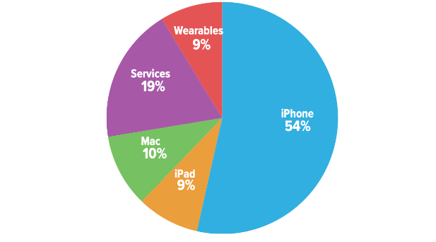
Pie charts
Pie charts show how a whole is divided into different elements such as total sales divided amongst different product types

Infographics
Infographics are easy to understand visual representations of data

Worked Example
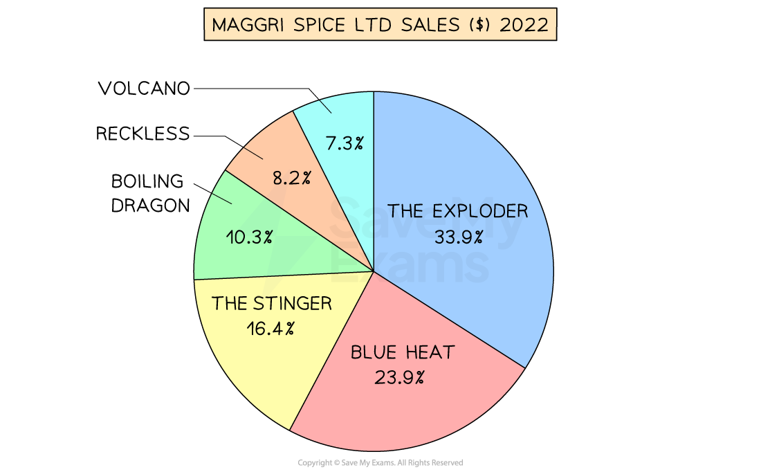
Maggri Spice Ltd manufactures a range of hot curry pastes that are sold online and in specialist stores.
In 2022 total sales were $180,000, with sales for individual products shown in the pie chart below.

Calculate the value of sales of Blue Heat curry paste in 2022.
[2]
Step 1: Identify the percentage of total sales attributed to Blue Heat
In this case, 23.9% of total sales can be attributed to Blue Heat
Step 2: Convert the percentage to a decimal
23.9% = 0.239 [1 mark]
Step 3 - Multiply total sales by the decimal
$180,000 x 0.239 = $43,020
Blue Heat curry paste achieved sales of $43,020 in 2022 [1 mark]
Examiner Tips and Tricks
You can make use of descriptive statistical techniques throughout both exam papers.
They are particularly useful when making comparisons or supporting chains of analysis to lead to a judgement. You do not have to wait to be told to use them in your work - become accustomed to applying them to data in your work as you move through the course.
Interpreting data using these tools is a higher level approach to application and demonstrates that you are making optimum use of data presented in case study materials - this really does impress the examiner!

Unlock more, it's free!
Did this page help you?