Graphing in Biology (DP IB Biology: HL): Revision Note
Written by: Emma Archbold
Updated on
Graphing in Biology
Sketch graphs
Sketch graphs are a way to represent qualitative trends where the variables shown are often proportional or inversely proportional
A simple sketch graph

A sketch graph of the relationship between time and volume of gas given off, these two variables show a proportional relationship trend
General guidance on drawing graphs
The types of graphs that students are expected to be able to draw include:
Bar charts
Histograms
Scatter graphs
Line / curve graphs
Pie charts
Tips for plotting data
Whatever type of graph you use, remember the following:
The data should be plotted with the independent variable on the x-axis and the dependent variable on the y-axis
Plot data points accurately
Use appropriate linear scales on axes
Choose scales that enable all data points to be plotted within the graph area
Label axes, with units included
Make graphs that fill the space the exam paper gives you
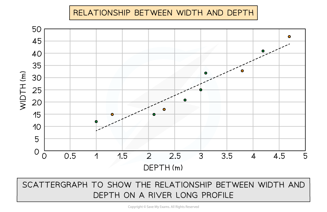
Draw a line of best fit. This may be straight or curved depending on the trend shown by the data. If the line of best fit is a curve make sure it is drawn smoothly. A line of best-fit should have a balance of data points above and below the line
In some cases, the line or curve of best fit should be drawn through the origin (but only if the data and trend allow it)
Continuous data represented in a line graph

Discontinuous data represented in a bar chart
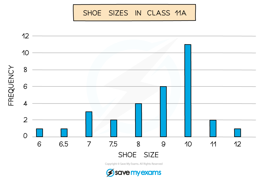
The line graph has been used to display continuous data over time while the bar chart has been used to display grouped data
Remember: The independent variable is the one you control or manipulate and the dependent variable is the one that changes as a result of your manipulation
Always draw data points in pencil as it makes it easier to make corrections and adjustments
Best fit lines
Students often confuse the term lines of best fit with straight lines
Lines of best fit can be straight lines or curves and:
They show the trend of the data
It does not have to go through all the points, but shows the general trend
They must go through the majority of the points
Where the data is scattered the points should be evenly distributed on either side of the best fit line
Graph to show use of a best fit line
Other features of graphs
Using a tangent to find the initial rate of a reaction
For linear graphs (i.e. graphs with a straight-line), the gradient is the same throughout
This makes it easy to calculate the rate of change (rate of change = change ÷ time)
However, many enzyme rate experiments produce non-linear graphs (i.e. graphs with a curved line), meaning they have an ever-changing gradient
They are shaped this way because the reaction rate is changing over time
In these cases, a tangent can be used to find the reaction rate at any one point on the graph:
A tangent is a straight line that is drawn so it just touches the curve at a single point
The slope of this tangent matches the slope of the curve at just that point
You then simply find the gradient of the straight line (tangent) you have drawn
The initial rate of reaction is the rate of reaction at the start of the reaction (i.e. where time = 0)
Worked Example
The graph below shows the results of an enzyme rate reaction. Using this graph, calculate the initial rate of reaction.
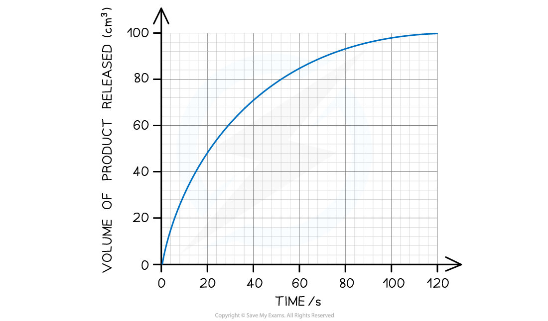
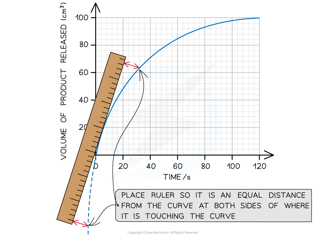
Step 1: Estimate the extrapolated curve of the graph
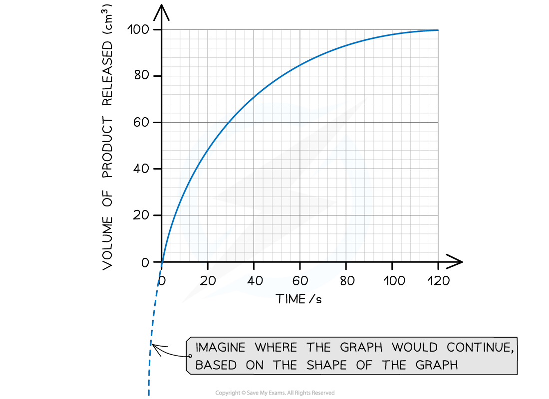
Step 2: Find the tangent to the curve at 0 seconds (the start of the reaction)
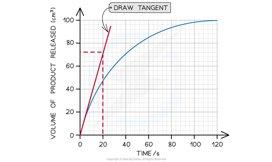
The tangent drawn in the graph above shows that 72 cm3 of product was produced in the first 20 seconds.
Step 3: Calculate the gradient of the tangent (this will give you the initial rate of reaction):
Gradient = change in y-axis ÷ change in x-axis
Initial rate of reaction = 72 cm3 ÷ 20 s
Initial rate of reaction = 3.6 cm3 s-1
Examiner Tips and Tricks
When drawing tangents: always use a ruler and a pencil; make sure the line you draw is perfectly straight; choose the point where the tangent is to be taken and slowly line the ruler up to that point; try to place your ruler so that none of the line of the curve is covered by the ruler (it is much easier if the curve is entirely visible whilst the tangent is drawn).There is a handy phrase to help you remember how to calculate the gradient of a tangent or line. Rise over run means that any increase/decrease vertically should be divided by any increase/decrease horizontally.
Changes in gradient
Graphs with curves of best fit have changing gradients
This means that multiple gradients can be calculated to show:
The progressing rate of a reaction
The effects of factors, such as concentration, on the rate of reaction
Intercepts
Intercepts are the points where a line / curve of best fit crosses an axis on a graph
Maxima and minima
The maxima and minima are the high and low points on a graph
Maxima are:
high points, or peaks, on a graph
points at which the gradient of the line passes from positive, though 0, to negative
Minima are:
low points, or troughs, on a graph
points at which the gradient of the line passes from negative, through 0, to positive
Uncertainty bars
The uncertainty in a measurement can be shown on a graph as an uncertainty bar
Uncertainty bars are plotted on graphs to show the absolute uncertainty of values plotted
Usually, these bars will be in the vertical direction for y-values, but they can be plotted horizontally for x-values
The size of the uncertainty bar can be used as an indication of the amount of uncertainty in the measurement
Graph with uncertainty bars

Uncertainty bars show the uncertainty in a specific measurement
Extrapolation and interpolation
Extrapolation is extending a line of best fit to estimate values that lie beyond the data points of a graph
Interpolation is using a line of best fit to estimate values that lie between data points of a graph
Extrapolation and interpolation on a graph

Interpolation uses the line of best fit between the plotted points and extrapolation extends the best fit line beyond the plotted points
Examiner Tips and Tricks
You will have to decide if the origin, point (0,0) should be included as a data point
If it does, it will be a good place to anchor the graph as it will be the most accurate data point
Some additional graph skills
In addition to plotting standard graphs like the examples above, there are some biology-specific examples that you need to have an understanding of
These are as follows:
Representing energy flow in the form of food chains, food webs and pyramids of energy
Representing familial genetic relationships using pedigree charts

Unlock more, it's free!
Was this revision note helpful?
