Bar Graphs & Mosaic Plots (College Board AP® Statistics): Study Guide

Side-by-side bar graphs
What is a side-by-side bar graph?
A side-by-side bar graph is used to visualize the data when working with two categorical variables
e.g. the favorite subject and school year of a random sample of students
They are similar to bar charts of one variable
The categories for one of the variables are labeled on one axis
e.g. the different subjects can be labeled along the x-axis
There are gaps between the different categories
The frequency or relative frequency is labeled on the other axis
The difference is that each bar is split into multiple bars
There are multiple bars for each category along the axis
e.g. the different school years
Each bar represents a joint frequency
These bars are drawn side-by-side
The bars are labeled or a key is used so that the categories of the second variable can be seen
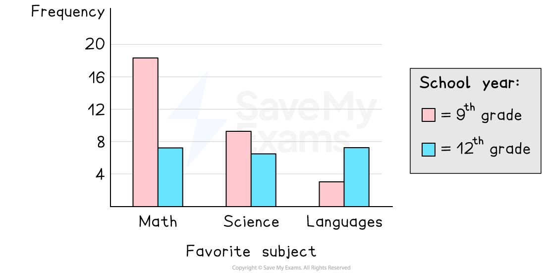
How can a side-by-side bar graph be used?
You can compare the frequencies of the categories of the first variable for a fixed category of the second variable by looking at the heights of the bars for the second variable
e.g. compare the frequencies of the favorite subjects for students in the 9th grade
You can compare the frequencies of the categories of the second variable for a fixed category of the first variable by looking at the heights of the bars for one category along the x-axis
e.g. compare the frequencies of the school years for students who prefer math
Side-by-side bar graphs get harder to interpret when there are a lot of categories for the variables
Segmented bar graphs
What is a segmented bar graph?
A segmented bar graph is used to visualize the data when working with two categorical variables
e.g. the favorite subject and school year of a random sample of students
They are similar to side-by-side bar graphs
The bars are stacked on top of each other instead of side-by-side
Conditional relative frequency is commonly used instead of joint frequency
This means that the stacked bars all have a height of 1
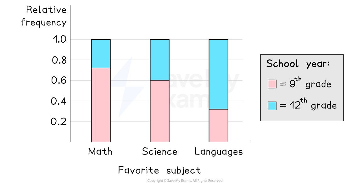
How can a segmented bar graph be used?
You can compare the conditional relative frequencies within the categories of the conditional variable by looking at the heights of the bars in one category along the x-axis
e.g. compare the proportion of people who prefer math who are also in the 9th grade with the proportion of people who prefer math who are also in the 12th grade
You can compare the conditional relative frequencies across the categories of the conditional variable by looking at the heights of the bars for the same variable in each category along the x-axis
e.g. compare the proportion of students who prefer math who are also in the 9th grade with the proportion of students who prefer science who are also in the 9th grade
If you use relative frequency for a segmented bar chart then you cannot compare frequencies
e.g. two bars with equal heights might not represent the same frequency
Mosaic plots
What is a mosaic plot?
A mosaic plot is used to visualise the data when working with two categorical variables
e.g. the favorite subject and school year of a random sample of students
They are similar to segmented bar graphs
The widths of the bars are proportional to the marginal relative frequencies
The areas of the bars are proportional to the joint (cell) frequencies
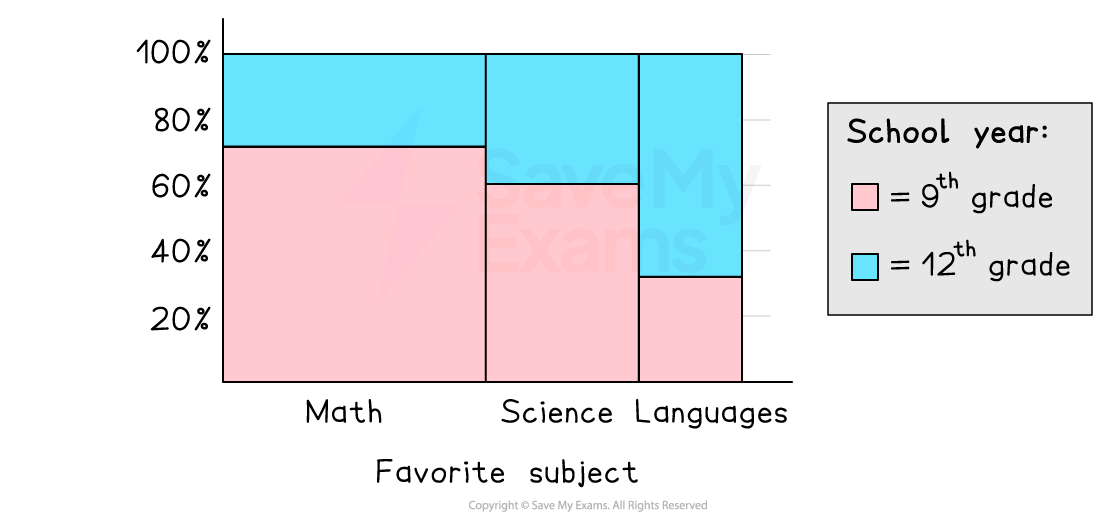
How can a mosaic plot be used?
You can compare the conditional relative frequencies within the categories of the conditional variable by looking at the heights of the bars in one category along the x-axis
e.g. compare the proportion of people who prefer math who are also in the 9th grade with the proportion of people who prefer math who are also in the 12th grade
You can compare the conditional relative frequencies across the categories of the conditional variable by looking at the heights of the bars for the same variable in each category along the x-axis
e.g. compare the proportion of students who prefer math who are also in the 9th grade with the proportion of students who prefer science who are also in the 9th grade
You can compare joint relative frequencies by looking at the areas of the bars
e.g. compare the proportion of students who prefer math and are in the 9th grade with the proportion of students who prefer science and are in the 12th grade
You can compare marginal relative frequencies by looking at the widths of the bars
e.g. compare the proportion of students who prefer math with the proportion of students who prefer science

You've read 0 of your 5 free study guides this week
Unlock more, it's free!
Did this page help you?