Water & Carbon Skills (AQA A Level Geography): Revision Note
Exam code: 7037
Water & Carbon Skills
Geographical skills are working skills essential to developing a synoptic approach to answering questions but also observing the 'bigger picture' in geography
Key terms
Quantitative data is measurable and can be expressed by numbers or placed into specific categories
Often used to test and prove previously specified concepts or hypotheses
Quantitative data is objective as it provides specific values
E.g. Barton-on-Sea beach in Dorset, UK is a short 1.75km, 20m wide, shingle and rock beach, backed by high, clay cliffs of between 5-10m
Qualitative data is descriptive information, usually written and presents features (quality) in an intuitive way
Often used to formulate theories and hypotheses
Qualitative data is subjective because it 'describes' from the angle of the viewer
E.g. The river is fast and dangerous or the wood is dark and feels dangerous
Primary data is data collected first-hand usually during fieldwork
It is real-time data specific to the investigation
E.g. Photograph taken of flood defences or species count using a quadrat
Secondary data is data collected by others and is used in support of primary data
It allows for studies of changes over time - census data collected by the government and compared
E.g. Maps, textbooks, websites, journals etc.
Big data are large datasets that need computational manipulation
Used to show trends, patterns and subsequent links
E.g. Geolocation, geospatial data, GIS (geographic information systems), Google Earth, satellite navigation etc.
Continuous data
Numerical data that can take any value within a given range
E.g. heights and weights
Discrete data
Numerical data that can only take certain values
E.g. shoe size
Line graph
One of the simplest ways to display continuous data
Both axes are numerical and continuous
Used to show changes over time and space
Table Showing Relative Strengths and Limitations of Line Graphs
Strengths | Limitations |
|---|---|
Shows trends and patterns clearly | Does not show causes or effects |
Quicker and easier to construct than a bar graph | Can be misleading if the scales on the axis are altered |
Easy to interpret | If there are multiple lines on a graph it can be confusing |
Anomalies are easy to identify | Often requires additional information to be useful |
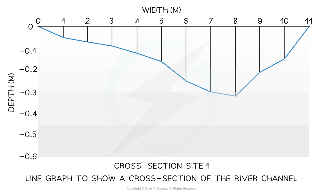
A river cross-section is a particular form of line graph because it is not continuous data, but the plots can be joined to show the shape of the river channel
Flow lines
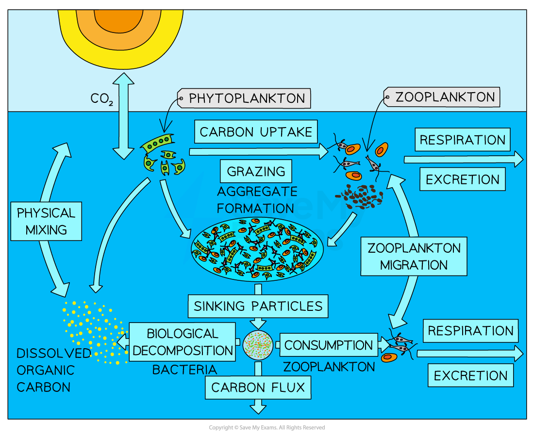
Useful for showing the strength of interaction between variables
Shows direction and volume along a specific path
E.g. the water and carbon cycle use flow lines
The lines can also be displayed to show proportion or importance using size or colour to highlight differences
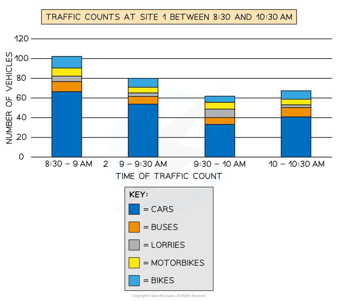
Compound or divided bar chart
The bars are subdivided to show the information with all bars totalling 100%
Divided bar charts show a variety of categories
They can show percentages and frequencies
Table Showing Relative Strengths and Limitations of Compound Graphs
Strengths | Limitations |
|---|---|
A large amount of data can be shown on one graph | A divided bar chart can be difficult to read if there are multiple segments |
Percentages and frequencies can be displayed on divided bar char | Can be difficult to compare sometimes |
Triangular graph
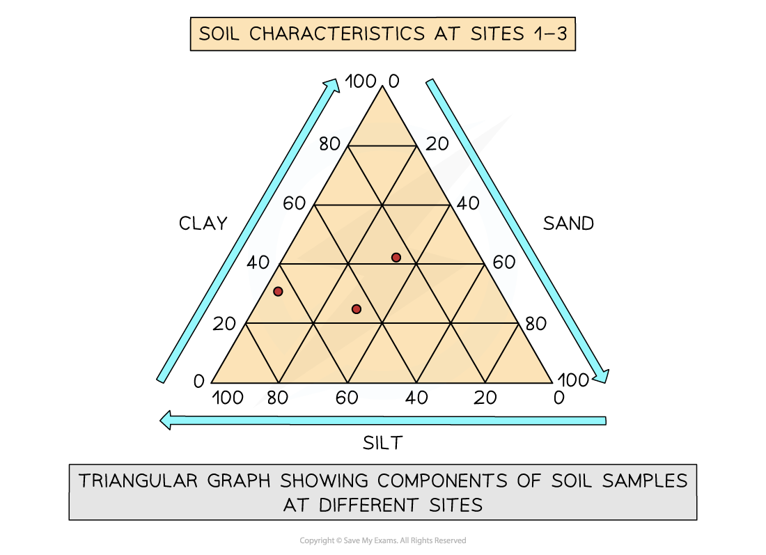
Have axes on three sides all of which go from 0-100
Used to display data which can be divided into three
The data must be in percentages
Can be used to plot data such as soil content, employment in economic activities
Read each side carefully so you are aware of which direction the data should go in
Examiner Tips and Tricks
In the exam, you will not be asked to draw an entire graph. However, it is common to be asked to complete an unfinished graph using the data provided. You may also be asked to identify anomalous results or to draw the best fit line on a scatter graph.
Take your time to ensure that you have marked the data on the graph accurately
Use the same style as the data which has already been put on the graph
Bars on a bar graph should be the same width
If the dots on a graph are connected by a line you should do the same
Mass balance
Mass balance is the input, output, and distribution of the water or carbon cycle between its flows/transfers within each stage of the system
It accounts for all the material in a process and can be measured locally (a single system) or globally
E.g. a student conducted a mass balance on a drainage basin and they concluded that approximately 84% of the water was directly recycled back to the river while 15% was indirectly returned via plant and sub-surface flows, with the final 1% being removed from the water cycle by deep aquifers
A balanced carbon cycle is the outcome of different components working in dynamic equilibrium with each other
The atmosphere's carbon composition is partly regulated by ocean and terrestrial photosynthesis
Soil health is maintained through decomposition, combustion and carbon storage which is important for ecosystem productivity etc.
Scatter graph
Points should not be connected
The best-fit line can be added to show the relations
Used to show the relationship between two variables
In a river study, they are used to show the relationship between different river characteristics such as the relationship between the width and depth of the river channel
Table Showing Relative Strengths and Limitations of Scatter Graphs
Strengths | Limitations |
|---|---|
Clearly shows data correlation | Data points cannot be labelled |
Shows the spread of data | Too many data points can make it difficult to read |
Makes it easy to identify anomalies and outliers | Can only show the relationship between two sets of data |
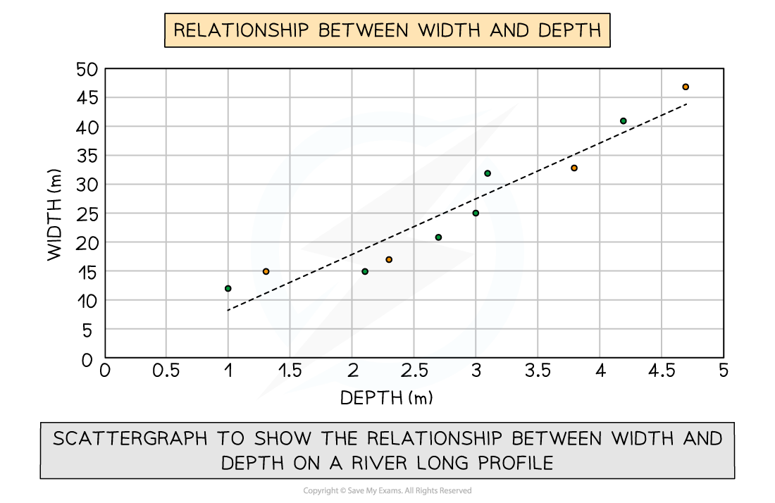
Types of correlation
Positive correlation
As one variable increases, so too does the other
The line of best fit goes from the bottom left to the top right of the graph
Negative correlation
As one variable increases the other decreases
The line of best fit goes from the top left to the bottom right of the graph
No correlation
Data points will have a scattered distribution
There is no relationship between the variables
Examiner Tips and Tricks
Always check when making calculations what the question has asked you to do. Is it asking for units to be stated or calculate to the nearest whole number or quote to 2 decimal places.
Worked Example
Making predictions from a set of data
Study Figure 1 below, which shows the cost against distance travelled
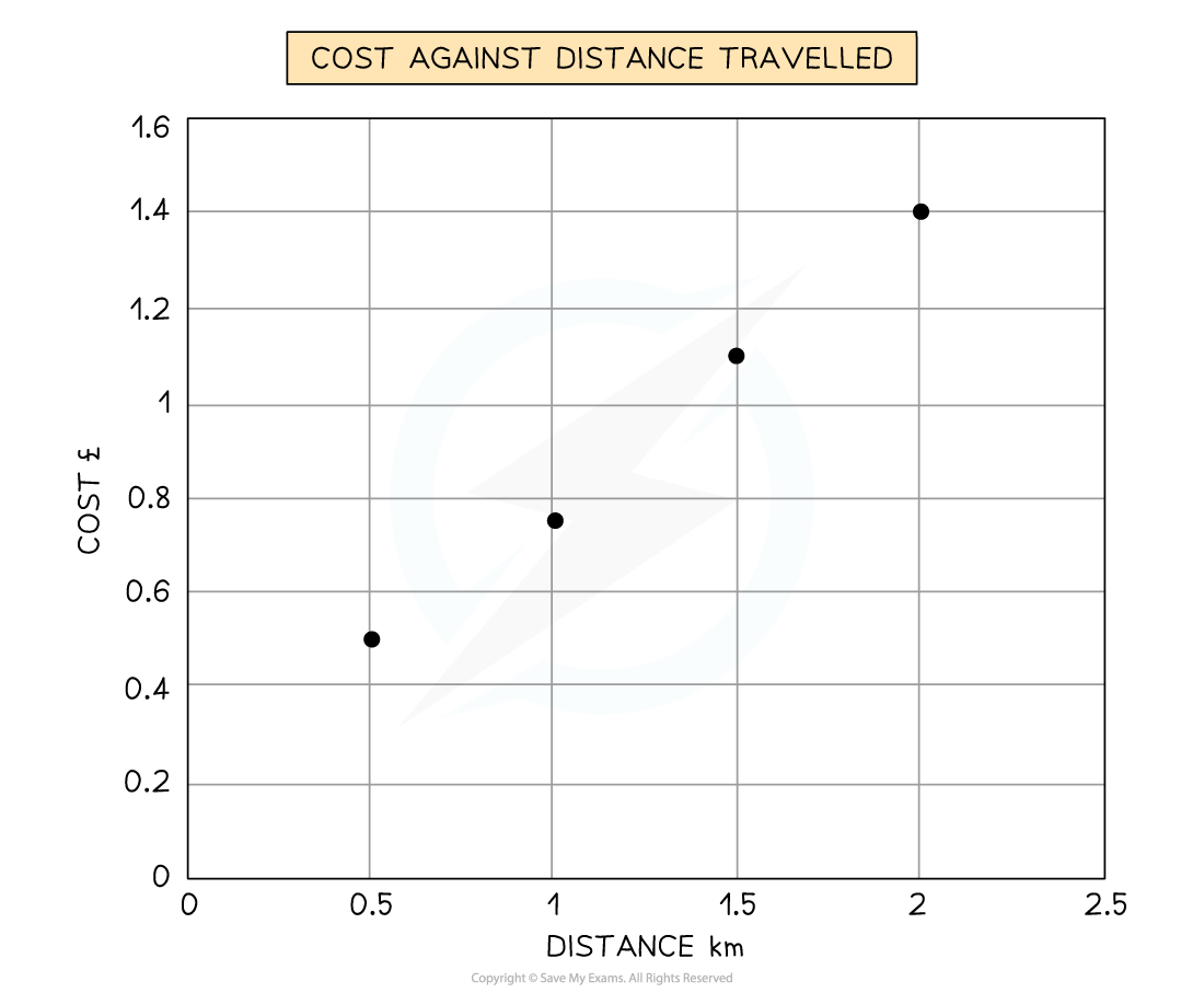
Figure 1
Predict what the cost at would be at 1.75km
[1 mark]
You may be asked to make a prediction for the next step in given data (either table or graph form) in your exam
Study the data carefully
Look at the direction in which the data is going
Are the numbers increasing or decreasing?
Is there a clear pattern forming?
E.g. does the data point value change by 3, 4, 6 etc. each time
Answer:
To predict the cost at 1.75 km, find the cost at 1.5 km and 2.0 km
Produce a line of best fit to predict the value at 1.75 km
Cost would be £1.3 [1]
Percentage and percentage change
To give the amount A as a percentage of sample B, divide A by B and multiply by 100
In 2020, 25 out of 360 homes in Catland were burgled
What is the percentage (to the nearest whole number) of homes burgled?
A percentage change shows by how much something has either increased or decreased
In 2021 only 21 houses were burgled. What is the percentage change in Catland?
There has been a decrease of 16% in the rate of burglaries in the Catland area
Remember that a positive figure shows an increase but a negative is a decrease
Worked Example
Study Figure 1 and analyse the data presented.
[6 marks]
Figure 1: change in greenhouse gas (GHG) emissions, grouped by relative wealth of country, between 1970 and 2010
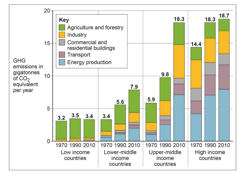
The best answers will use and manipulate the data; spot trends and anomalies, and make clear connections between different aspects of the data and evidence
Answer:
Figure 1 shows that high income countries are still the biggest contributors to GHG production [1] but that there has been little growth between 1990 and 2010 in particular (0.4 Gigatonnes of CO2) [1]. It is upper-middle income countries that have seen the fastest rates of growth of the time periods [1]. For instance, there has been an almost doubling from 9.8 to 18.3 gigatonnes of CO2 produced. Industry appears to have more than doubled in its contribution to GHG in this group of countries (from approximately to 2 to around 5 gigatonnes) [1d].
Low and low-middle income countries contribute relatively little to the overall GHG emissions [1], with LICs emissions appear to be shrinking. For instance, combined in 2010 they produced only 11.3 gigatonnes [1], 7.4 gigatonnes less than high income countries [1]. These countries greatest contribution comes through agriculture (especially for low income countries) with very little through energy use and transport [1].
Statistical Skills
This is the study and handling of data, which includes ways of gathering, reviewing, analysing, and drawing conclusions from data
Mean, median, mode and range
Mean = average value (all the values added and divided by the number of items)
Median = middle value when ordered in size
Mode = most common value
Range = difference between the highest value and lowest value
Sample site | 1 | 2 | 3 | 4 | 5 | 6 | 7 |
|---|---|---|---|---|---|---|---|
Number of pebbles | 184 | 90 | 159 | 142 | 64 | 64 | 95 |
Taking the example above to calculate:
Mean -
Median - reordering by size =
= 95 is the middle value
Mode - only 64 appears more than once
Range -
Upper, lower and inter quartile range
These are the values of a quarter (25%) [lower quartile (LQ)] and three-quarters (75%) [upper (UQ)] of the ordered data
No. of shoppers | 2 | 3 | 6 | 6 | 7 | 9 | 13 | 14 | 17 | 22 | 22 |
|
|
| Lower quartile |
|
| Median |
|
| Upper quartile |
|
|
The interquartile range (IQR) is the difference between the upper (UQ) and lower quartile (LQ)
It measures the spread (dispersion) of data around the median
A large number shows the numbers are fairly spread, whereas, a small number shows the data is close to the median
UQ - LQ = IQ [
]
Standard deviation
This measures dispersion more reliably than IQR and the symbol for it is 'σ' (sigma)
The formula is
Σ means 'sum of' and
is another way of writing 'mean' and 'n' is the number of samples taken
Work out individual aspects of the formula first e.g. the mean
Sample results:
Sample site | 1 | 2 | 3 | 4 | 5 |
|---|---|---|---|---|---|
Number of pebbles | 5 | 9 | 10 | 11 | 14 |
Calculate the mean -
Calculate
for each number
Square each of those values (the square of a negative number becomes positive)
Add the squared values to give
Divide the total by 'n'
Finally, find the square root
(x-x¯) | |||
|---|---|---|---|
5 | 9.8 | -4.8 | 23.04 |
9 | 9.8 | -0.8 | 0.64 |
10 | 9.8 | 0.2 | 0.04 |
11 | 9.8 | 1.2 | 1.44 |
14 | 9.8 | 4.2 | 17.64 |
Σ = 42.8 | |||
σ = 42.85 = 2.93 (2 dp)
Numbers closely grouped around the mean shows a small deviation
A large standard deviation would show a set of numbers that were spread out
Spearman's rank correlation coefficient
A test to determine if two sets of numbers have a relationship
Not the easiest to calculate
Σ means 'sum of', d is the difference and 'n' is the number of samples taken
The formula is rs = 1 - 6∑d2n3 - n
Rank each number in both sets of data, with the highest number given rank 1, second highest 2 etc.
Calculate 'd' which is the difference between ranks of each group e.g. ranks for group 5 are 4 and 6; difference will be 2
Square value 'd' and calculate the total d2 to find ∑d2
Finally, calculate the coefficient of rs using the above formula
The resulting number should always be between -1 and +1
GNP ($) per capita and Life Expectancy (years)
Country | GNP | Rank | Life Expectancy | Rank | d | d2 |
|---|---|---|---|---|---|---|
1 | 15,124 | 5 | 73 | 5 | 0 | 0 |
2 | 20,535 | 4 | 72 | 6 | 2 | 4 |
3 | 10.432 | 9 | 68 | 8 | 1 | 1 |
4 | 7,050 | 11 | 62 | 11 | 0 | 0 |
5 | 22,950 | 3 | 76 | 3 | 0 | 0 |
6 | 14,800 | 6 | 75 | 4 | 2 | 4 |
7 | 23,752 | 2 | 77 | 2 | 0 | 0 |
8 | 36,875 | 1 | 79 | 1 | 0 | 0 |
9 | 5,525 | 12 | 61 | 12 | 0 | 0 |
10 | 8,678 | 10 | 66 | 9 | 1 | 1 |
11 | 12,211 | 8 | 65 | 10 | 2 | 4 |
12 | 13,500 | 7 | 70 | 7 | 0 | 0 |
n=12 | Σd2 = 14 | |||||
Σd2 = 14 and n =12.
rs =1 -6 ×14123 - 12 = 1- 841716 =1-0.048951 (0.05) = 0.95
(0.048951 can be rounded to 2 decimal places giving 0.05)
A positive result shows a positive correlation, where one variable increases so does the other
The closer the number is to 1, the stronger the positive correlation
A negative results shows a negative correlation, where one variable increases the other decreases
The closer the number is to -1 the stronger the negative correlation
If however, the correlation is 0 or near to 0, there is no relationship
Determining significance
Spearman's rank may show that two sets of numbers are correlated, however, it does not show how significant the link between the two values are
To check for significance; a table of critical values or a graph is needed
This looks at the probability of the links occurring by chance
A 5% or higher probability of chance is not significant evidence for a link
1% or less is a significant evidence of a link
This is the significance level of a statistical test
The degrees of freedom needs calculating - n-2
Using the example above: 12 - 2 = 10 degrees of freedom
As rs = 0.95 then the correlation has a less than 1% probability of being by chance
Therefore, there is a high significance level of a relationship between GNP and life expectancy
Spearman’s Rank Correlation Significance Table
Degrees of Freedom | 5% (0.05) | 1% (0.01) |
|---|---|---|
8 | 0.72 | 0.84 |
9 | 0.68 | 0.80 |
10 | 0.64 | 0.77 |
11 | 0.60 | 0.74 |
12 | 0.57 | 0.71 |
13 | 0.54 | 0.69 |
14 | 0.52 | 0.67 |
15 | 0.50 | 0.65 |
20 | 0.47 | 0.59 |
Examiner Tips and Tricks
Always check when making calculations what the question has asked you to do. Is it asking for units to be stated or calculate to the nearest whole number or quote to 2 decimal places.

You've read 0 of your 5 free revision notes this week
Unlock more, it's free!
Did this page help you?