Quantitative Sales Forecasting (Edexcel A Level Business): Revision Note
Exam code: 9BS0

Introduction to quantitative sales forecasting
The sales forecast is an important business planning tool
It provides an estimation of future sales figures using past data and considering predictable external factors
Sales forecasts can be used to identify trends in product sales, which can then be compared with the market as a whole
Methods used in quantitative sales forecasting
Method | Explanation |
|---|---|
Moving averages |
|
Extrapolation |
|
Correlation |
|
Calculation of time: Series analysis
Moving averages
Sometimes, past sales data is too erratic for clear trends to be identified
A moving average smooths raw data and allows analysts to spot patterns, even when sales are subject to seasonal variations
Four-month or twelve-month moving averages are used where seasonality is a key factor in sales
Calculating moving averages
The moving total is calculated by adding together sales figures for a specified number of periods
E.g. a three-month moving total is calculated by adding the first three months, followed by the second three months and the third three months and so on
The centred average is calculated by dividing the moving total by the specified number of periods
E.g. a three-month centred average is calculated by dividing the three-month moving total by three
A series of centred averages is known as the moving average
Worked Example
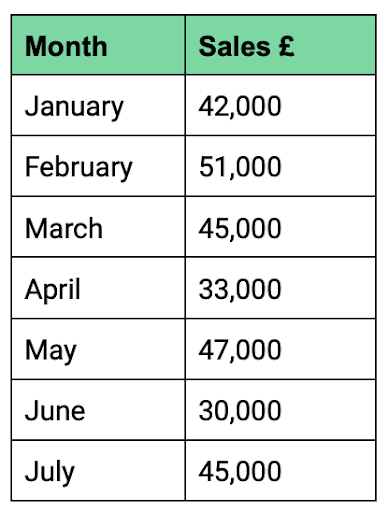
RJ Inflatables is a manufacturer of novelty celebration balloons. Its monthly sales from January to July are shown in Table A.
Rachel Jameson, the managing director, is concerned that sales are declining but is struggling to identify a trend with the sales data she has available. Rachel’s financial administrator has suggested using a moving average so that she can forecast future sales with greater accuracy.
Table A
Calculate a three-month moving average using RJ Inflatables's January to July sales data.
(6)
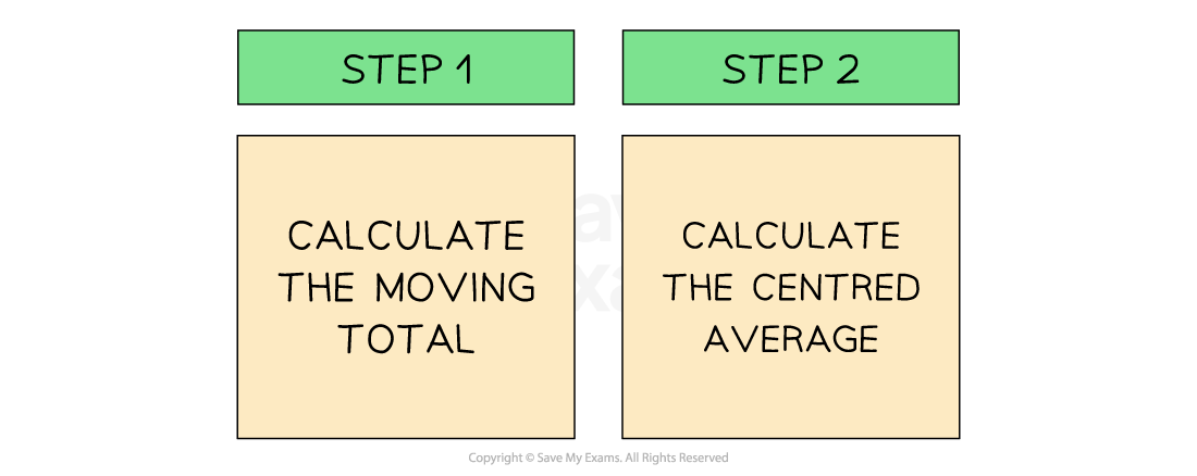
Step 1: Calculate the three-month moving total of sales for each group of three months
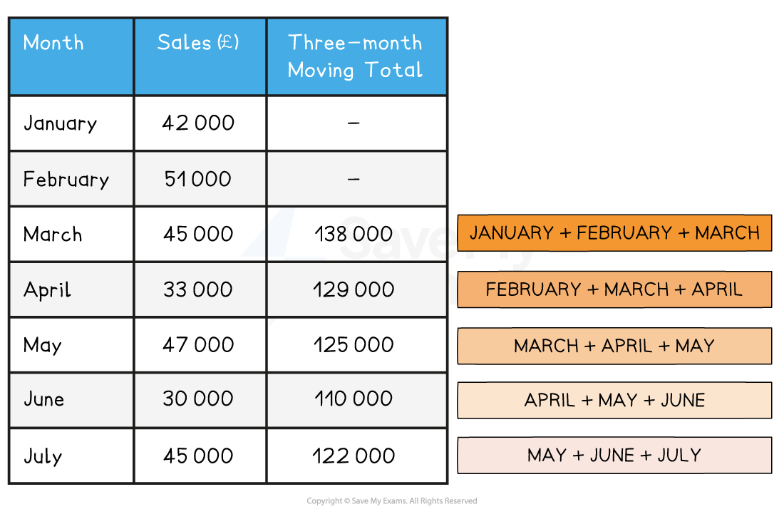
Step 2: Calculate the three-month centred average for each group of three months

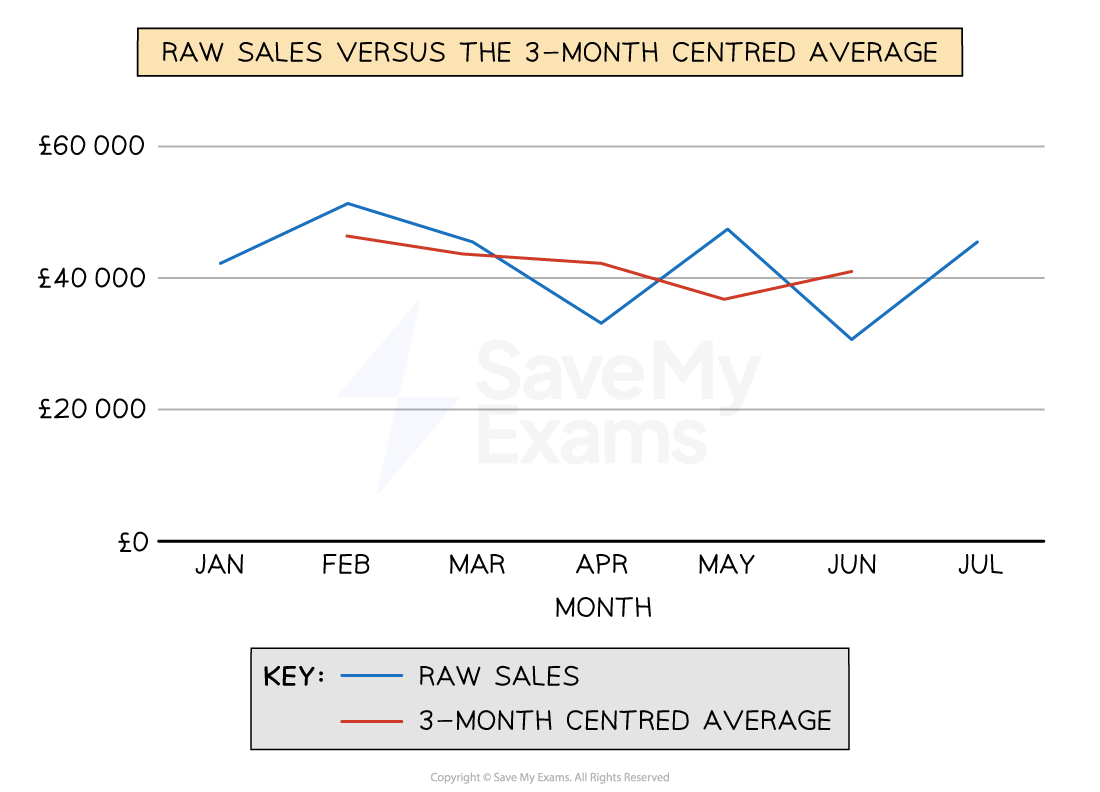
When plotted on the same graph, the three-month centred average provides a smoother curve, which makes extrapolation of the data for forecasting relatively straightforward
Raw data compared to the moving average
Interpreting scatter graphs
Scatter graphs allow businesses to compare two variables, such as sales volume and advertising, to establish if there is any correlation between them
Example scatter graph

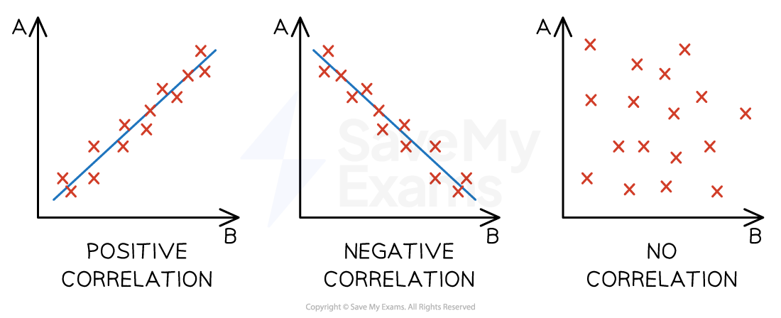
Types of correlation
A correlation exists where there is a relationship or connection between two variables
A positive correlation means that as one variable increases, so does the other variable
A line of best fit that slopes upwards can be identified
A negative correlation means that as one variable increases, the other variable decreases
A line of best fit that slopes downwards can be identified
No correlation means that there is no connection between the two variables
Therefore, it is not possible to identify a line of best fit
Diagrams of correlation types
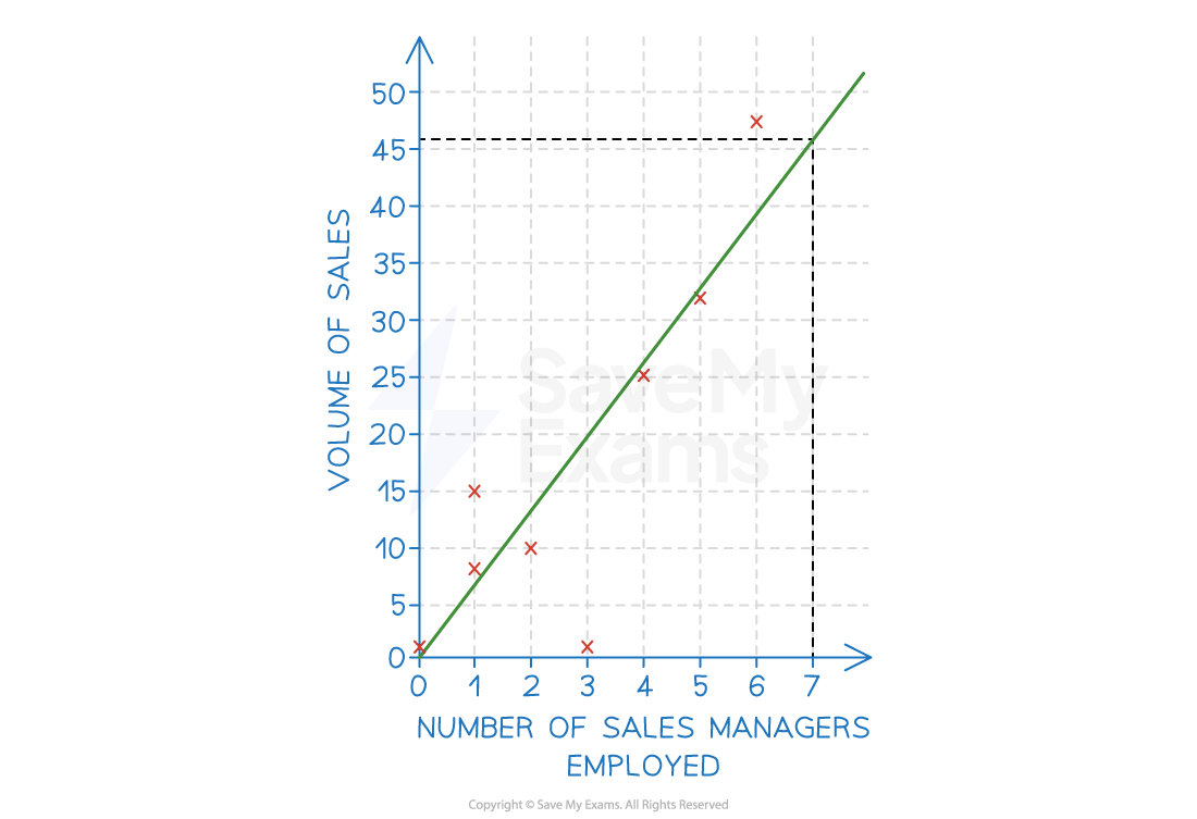
Correlation does not always indicate a relationship or causation between two sets of variables, so businesses need to conduct research to establish whether a relationship exists, as well as the strength of that relationship
Where a line of best fit can be identified, and when causation is determined, a business can extrapolate the data to make predictions around changes to either of the variables
E.g. extrapolating the line of best fit in the example below, the business could predict that employing seven sales managers would likely result in sales of 46 units
Extrapolation assumes that what has happened in the past will be the same as what will happen in the future
Extrapolation using a line of best fit
Examiner Tips and Tricks
When drawing a line of best fit, you should try to include as many data points above the line as below the line.
Watch out for outlying data — if there is more than one outlier above the line, adjust your line of best fit upwards. Similarly, if there is more than one outlier below the line, adjust your line of best fit downwards. Just one outlier should not influence your line of best fit.
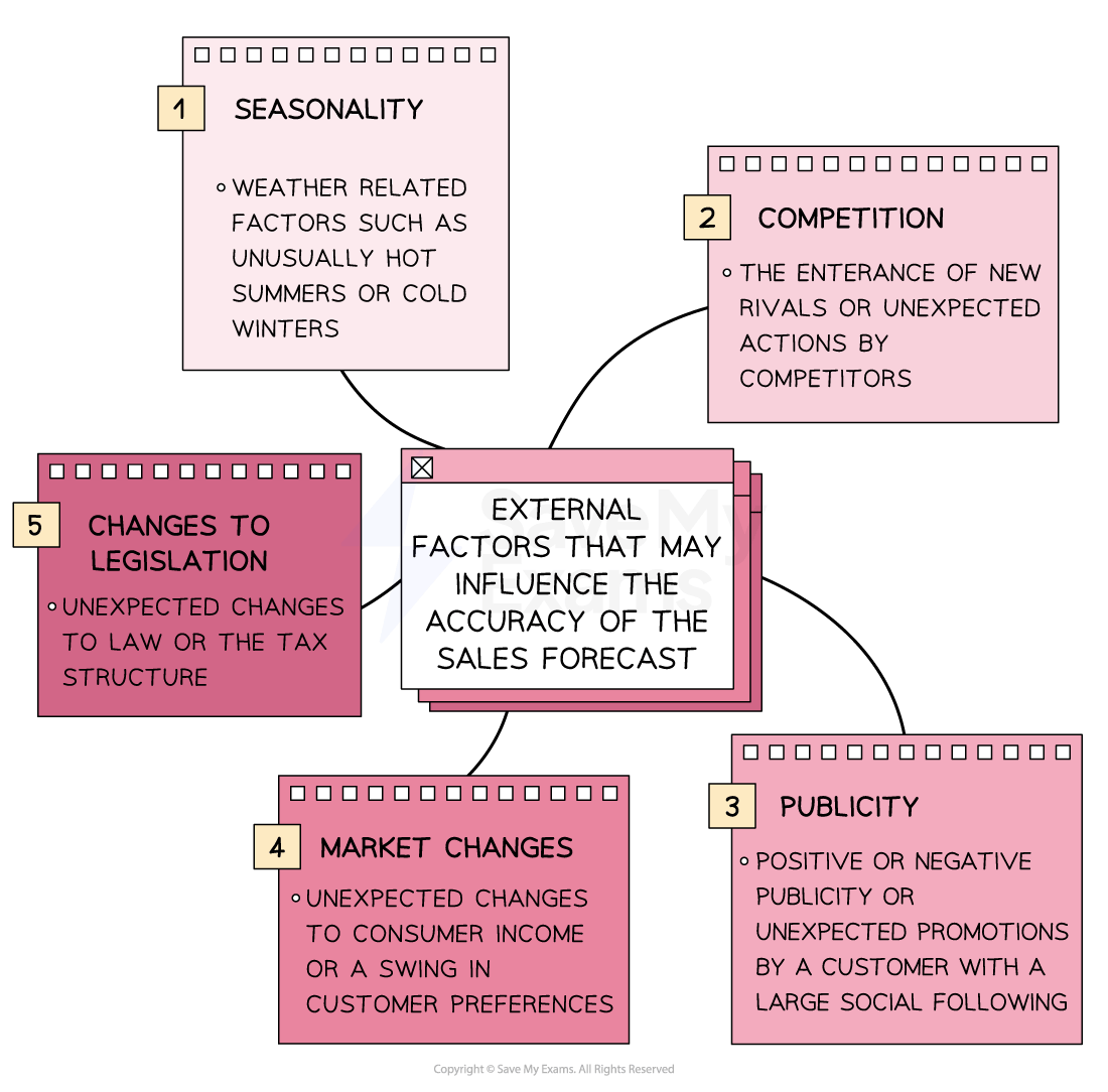
Limitations of quantitative sales forecasting
Quantitative sales forecasting techniques are useful when the future is expected to reflect what has happened in the past
It is especially effective in the short term
In the longer term, uncertainties — especially in the external environment — can make simple extrapolation of past data unreliable
Factors affecting the accuracy of sales forecasts
In many cases, the sales forecast can provide little more than an estimate of future performance
As long as it is approximately accurate, businesses can use the sales forecast to plan resources, such as staff, finance and production, and to produce budgets
Businesses can improve the accuracy of sales forecasts by:
Conducting detailed market research
Employing experts with excellent market knowledge
Revising the sales forecasts frequently
Forecasting for the short- to medium-term

Unlock more, it's free!
Join the 100,000+ Students that ❤️ Save My Exams
the (exam) results speak for themselves:

Was this revision note helpful?