Mathematical Analysis of Results (OCR A Level Biology): Revision Note
Exam code: H420

Written by: Lára Marie McIvor
Updated on
Mathematical Analysis of Results
Quantitative investigations of variation can involve the interpretation of mean values and their standard deviations
A mean value describes the average value of a data set
Standard deviation is a measure of the spread or dispersion of data around the mean
A small standard deviation indicates that the results lie close to the mean (less variation)
Large standard deviation indicates that the results are more spread out
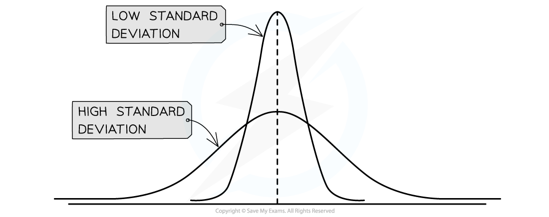
Two graphs showing the distribution of values when the mean is the same but one has a large standard deviation and the other a small standard deviation
Comparison between groups
When comparing the results from different groups or samples, using a measure of central tendency, such as the mean, can be quite misleading
For example, looking at the two groups below
Group A: 2, 15, 14, 15, 16, 15, 14
Group B: 1, 3, 10, 15, 20, 22, 20
Both groups have the same mean of 13
However, most of the values in group A lie close to the mean, whereas in group B most values lie quite far from the mean
For comparison between groups or samples it is better practice to use standard deviation in conjunction with the mean
Whether or not the standard deviations of different data sets overlap can provide a lot of information:
If there is an overlap between the standard deviations then it can be said that two sets of results are not significantly different
If there is no overlap between the standard deviations then it can be said that two sets of results are significantly different
Worked Example
A group of scientists wanted to investigate the effects of a specific diet on the risk of coronary heart disease. One group was given a specific diet for 8 weeks, while the other group acted as a control. After the 8 weeks scientists measured the diameter of the lumen of the main artery in the arm of the volunteers. The results of the experiment are shown in Table 1 below:
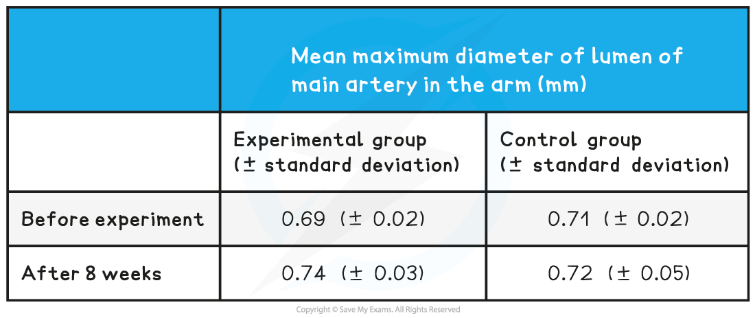
Use the standard deviations above to evaluate whether the diet had a significant effect?
[2 marks]
Answer:
Step one: find the full range of values included within the standard deviations for each data set
Experimental group before: 0.67 to 0.71mm
Experimental group after: 0.71 to 0.77mm
Control group before: 0.69 to 0.73mm
Control group after: 0.67 to 0.77mm
Step two: use this information to form your answer
There is an overlap of standard deviations in the experimental group before and after the experiment (0.67~0.71mm and 0.71~0.77mm) so it can be said that the difference before and after the experiment is not significant; [1 mark]
There is also an overlap of standard deviations between the experimental and control groups after the eight weeks (0.71~0.77mm and 0.67~0.77mm) so it can be said that the difference between groups is not significant; [1 mark]
Examiner Tips and Tricks
The standard deviations of a data set are not always presented in a table, they can also be represented by standard deviation error bars on a graph.
Plotting & Interpreting Graphs
Plotting data from investigations in the appropriate format allows you to more clearly see the relationship between two variables
This makes the results of experiments much easier to interpret
First, you need to consider what type of data you have:
Qualitative data (non-numerical data e.g. blood group)
Discrete data (numerical data that can only take certain values in a range e.g. shoe size)
Continuous data (numerical data that can take any value in a range e.g. height or weight)
For qualitative and discrete data, bar charts or pie charts are most suitable
For continuous data, line graphs or scatter graphs are most suitable
Scatter graphs are especially useful for showing how two variables are correlated (related to one another)
Tips for plotting data
Whatever type of graph you use, remember the following:
The data should be plotted with the independent variable on the x-axis and the dependent variable on the y-axis
Plot data points accurately
Use appropriate linear scales on axes
Choose scales that enable all data points to be plotted within the graph area
Label axes, with units included
Make graphs that fill the space the exam paper gives you
Draw a line of best fit. This may be straight or curved depending on the trend shown by the data. If the line of best fit is a curve make sure it is drawn smoothly. A line of best-fit should have a balance of data points above and below the line
In some cases, the line or curve of best fit should be drawn through the origin (but only if the data and trend allow it)
Using a tangent to find the initial rate of a reaction
For linear graphs (i.e. graphs with a straight-line), the gradient is the same throughout
This makes it easy to calculate the rate of change (rate of change = change ÷ time)
However, many enzyme rate experiments produce non-linear graphs (i.e. graphs with a curved line), meaning they have an ever-changing gradient
They are shaped this way because the reaction rate is changing over time
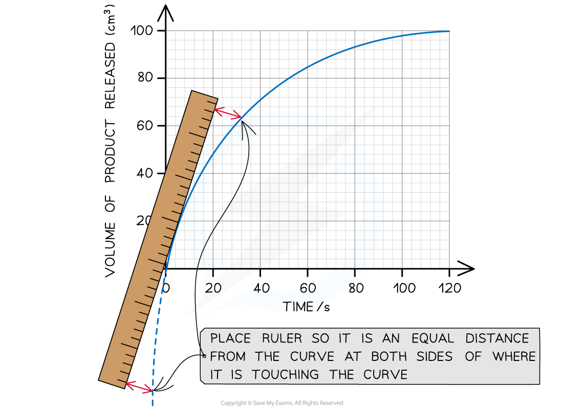
In these cases, a tangent can be used to find the reaction rate at any one point on the graph:
A tangent is a straight line that is drawn so it just touches the curve at a single point
The slope of this tangent matches the slope of the curve at just that point
You then simply find the gradient of the straight line (tangent) you have drawn
The initial rate of reaction is the rate of reaction at the start of the reaction (i.e. where time = 0)
Worked Example
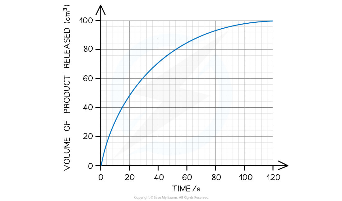
The graph below shows the results of an enzyme rate reaction. Using this graph, calculate the initial rate of reaction.
Answer:
Step 1: Estimate the extrapolated curve of the graph
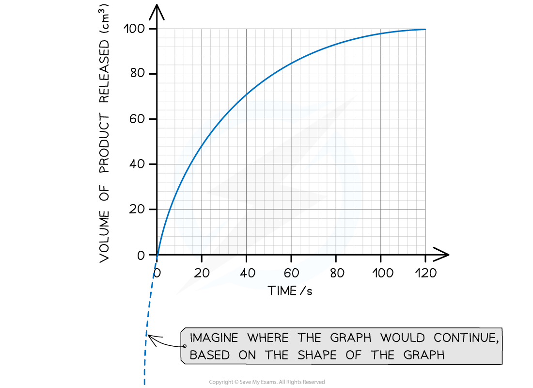
Step 2: Find the tangent to the curve at 0 seconds (the start of the reaction)
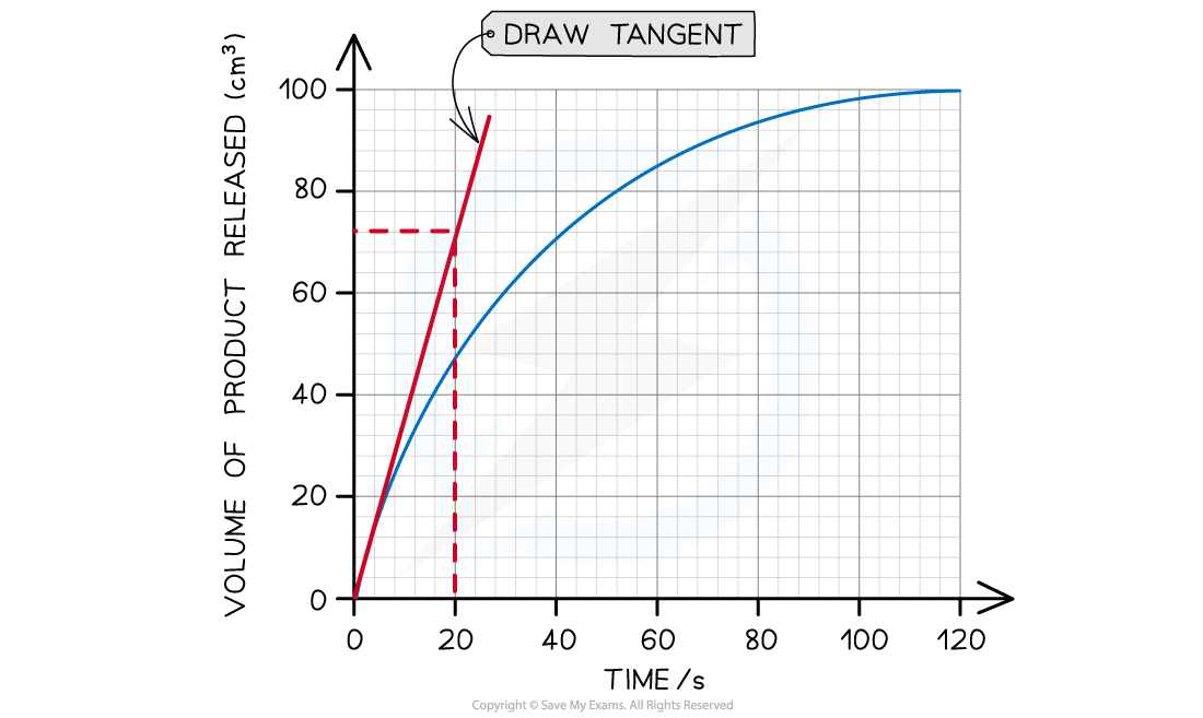
The tangent drawn in the graph above shows that 72 cm3 of product was produced in the first 20 seconds.
Step 3: Calculate the gradient of the tangent (this will give you the initial rate of reaction):
Gradient = change in y-axis ÷ change in x-axis
Initial rate of reaction = 72 cm3 ÷ 20 s
Initial rate of reaction = 3.6 cm3 s-1
Examiner Tips and Tricks
When drawing tangents: always use a ruler and a pencil; make sure the line you draw is perfectly straight; choose the point where the tangent is to be taken and slowly line the ruler up to that point; try to place your ruler so that none of the line of the curve is covered by the ruler (it is much easier if the curve is entirely visible whilst the tangent is drawn).There is a handy phrase to help you remember how to calculate the gradient of a tangent or line. Rise over run means that any increase/decrease vertically should be divided by any increase/decrease horizontally.

Unlock more, it's free!
Join the 100,000+ Students that ❤️ Save My Exams
the (exam) results speak for themselves:

Was this revision note helpful?